
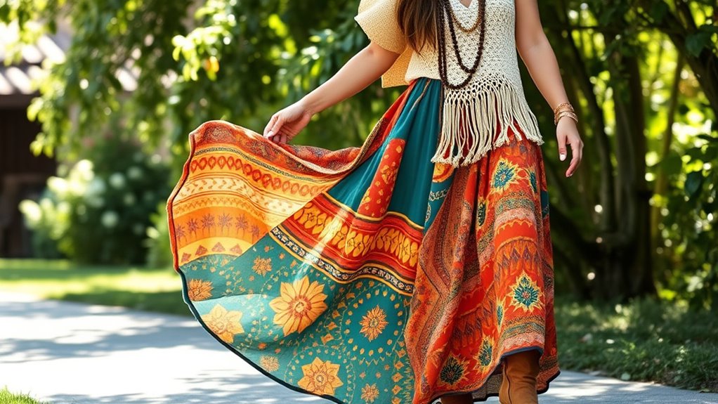
To create a stylish boho color palette, mix warm earth tones like terracotta, mustard, and olive with vibrant hues such as turquoise, coral, and fuchsia. Balance bold prints with neutral basics like beige or brown to keep outfits cohesive. Layer textures, use accessories to tie colors together, and experiment with pattern mixing from florals to geometrics. Keep your palette harmonious with 6-12 shades for versatile, eye-catching outfits that reflect your unique boho style. Discover more tips to perfect your look.
Key Takeaways
- Build a cohesive boho palette with warm earth tones and vibrant accents, limiting to 6-12 harmonious hues for versatile mixing.
- Use neutral solids as bases to balance bold prints and create visual harmony across your wardrobe.
- Incorporate textured fabrics like crochet, suede, and linen to add depth without overwhelming patterns.
- Mix different print scales and patterns, pairing small florals with larger stripes for visual interest.
- Balance statement prints with subdued neutrals and accessories to maintain a cohesive, stylish boho look.
Embrace Warm Earth Tones and Vibrant Hues

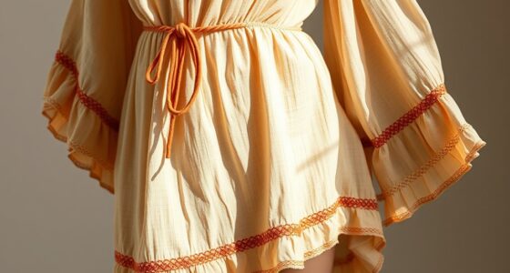
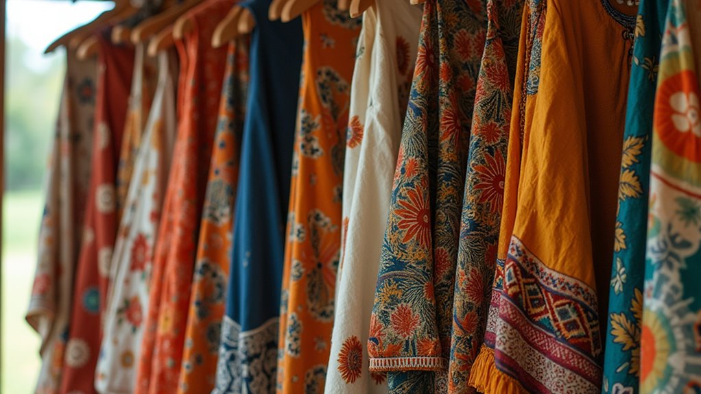
To create a mesmerizing boho look, start by embracing warm earth tones like terracotta, mustard, olive, and rust. These warm hues form a cozy, grounded base that defines your boho palette. Incorporate vibrant colors such as deep turquoise, coral, and fuchsia to add lively pops of energy that make your outfits stand out. Mixing and matching these shades in prints and solids creates versatile, eye-catching combinations. Cozy neutrals, like beige and warm browns, balance the vivid hues and highlight statement pieces and accessories. By thoughtfully blending earthy tones with vibrant colors, you craft a wardrobe that feels harmonious yet dynamic. This approach guarantees your boho style remains authentic, lively, and perfectly suited for endless styling possibilities.
Building a Cohesive Color Palette for Versatile Styling
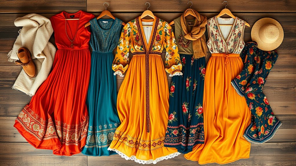
To build a versatile boho wardrobe, start by selecting complementary hues that work well together. Incorporate neutral tones like beige and taupe as a foundation to balance bolder colors and prints. Sticking to a consistent color palette makes mixing and matching effortless, giving your outfits a cohesive, stylish look. To enhance your wardrobe with authentic textures, consider integrating natural materials such as linen and cotton that reflect a relaxed, bohemian vibe. Regularly inspecting your clothing for wear and tear ensures longevity and keeps your wardrobe looking fresh.
Select Complementary Hues
Selecting complementary hues is essential for building a cohesive boho color palette that’s versatile and easy to style. To do this, focus on hues adjacent on the color wheel, such as blues and greens or reds and oranges, for natural visual harmony. Consider these steps:
- Use the color wheel to identify complementary hues that create vibrant yet balanced pairings.
- Incorporate neutral tones like beige, white, and gray alongside your bright colors to add versatility.
- Limit your palette to 6-12 hues to keep your boho palette cohesive and manageable.
- Match prints and fabrics that share common shades for effortless mixing prints and maintaining visual harmony.
This approach helps you select hues that work well together, making pairing colors seamless and stylish.
Incorporate Neutral Tones
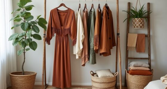
Incorporating neutral tones like white, beige, brown, and black creates a versatile foundation for your boho palette that effortlessly balances vibrant prints and textures. These foundational colors form an earthy palette that anchors your outfits while allowing bold patterns and rich textures to shine. Using versatile shades as base layers simplifies mixing and matching different prints, making cohesive styling easier. Neutral wardrobe staples in natural materials like wood, straw, or woven fibers enhance the relaxed, earthy vibe of boho fashion. Additionally, choosing neutral tire pressure ensures comfort and performance whether you’re embracing casual or more adventurous styles. Maintaining a balanced color scheme helps create a harmonious look that is both stylish and adaptable, essential for versatile boho outfits. By establishing a cohesive neutral palette, you create a flexible, timeless framework that adapts seamlessly to seasonal updates or trend-driven pieces. This approach ensures your wardrobe remains effortlessly coordinated, emphasizing natural beauty and authentic style.
Use a Consistent Palette
Building a cohesive color palette involves choosing 6 to 12 harmonious hues that work well together across your wardrobe. This guarantees versatility and a polished, boho-inspired look. To achieve this:
- Select a mix of neutral tones, pastels, and deep hues to create visual harmony.
- Incorporate both warm and cool colors to make mixing and matching prints effortless.
- Use a consistent color theme across prints, textiles, and accessories to strengthen print coordination.
- Limit bold colors in each outfit, balancing statement pieces with subdued hues for a seamless, cohesive look.
- Being aware of color harmony principles can help you create more balanced and visually appealing outfits. Additionally, understanding how contrast ratios influence visual interest can enhance your styling choices.
- Paying attention to color temperature can help you achieve a more unified and flattering overall appearance. Sticking to a unified color palette helps you easily mix and match prints without clashing, enhancing your overall style. This approach cultivates visual harmony and simplifies versatile styling. Familiarity with color psychology can also guide you in selecting hues that evoke specific moods and complement your personal vibe.
Balancing Bold Prints With Neutral Foundations
Balancing bold prints with neutral foundations is key to creating a cohesive and stylish Boho look. Neutral tones like whites, beiges, and browns provide a versatile backdrop that lets bold prints stand out without overwhelming your outfit. Incorporating solids helps maintain wardrobe balance, ensuring the visual harmony of your ensemble. Using neutral colors as a base makes it easier to mix textiles and patterns, enhancing outfit coordination. These neutral foundations act as a visual anchor, preventing clashing and allowing statement pieces to shine. Pairing vibrant prints with subdued neutrals creates a balanced, polished appearance. By grounding bold patterns with neutral elements, you achieve a harmonious and effortlessly chic Boho style that’s both versatile and eye-catching. Attention to attention to detail is crucial for identifying the right balance between prints and neutrals, ensuring your outfit looks polished and intentional. Additionally, understanding entertainment and parks hours can help you plan your wardrobe around busy days or special outings, making sure your look is always ready for any occasion. Incorporating color theory principles can further refine your choices, creating visually pleasing combinations that enhance your overall style. Moreover, being aware of free floating styles can inspire you to mix and match prints in a way that feels natural and free-spirited. A thoughtful approach to accessorizing can further elevate your ensemble by adding subtle accents that tie the look together.
Layering Hues for Depth and Artistic Flair

To add depth and flair to your boho look, focus on layering hues within the same color family or using contrasting yet complementary tones. Neutral foundations, like earthy browns or soft creams, provide a perfect base for vibrant or layered shades to stand out. Incorporating translucent fabrics or varying color intensities can also enhance the visual richness of your outfit. Exploring different color palettes can further elevate your styling and ensure a harmonious yet dynamic appearance. Additionally, considering current fashion trends can help you select colors and prints that resonate with contemporary boho aesthetics. Regularly assessing your wardrobe through decluttering strategies can keep your collection fresh and inspiring. Incorporating elements from local water parks can inspire playful and refreshing color combinations perfect for summer-inspired boho styles. Using texture mixing within your outfits can also add an extra layer of visual interest and tactile appeal.
Use of Neutral Foundations
Neutral foundations like whites, beiges, and browns serve as a versatile base that makes vibrant prints and bold hues pop without clashing. By layering different neutral tones, you add depth and dimension to your outfit, enhancing the boho aesthetic. To elevate your look, consider these tips:
- Mix textured fabrics like linen, cotton, or woven straw for tactile interest.
- Use neutral shades to create cohesive styling that balances multiple prints and hues.
- Layer neutrals to add visual warmth and depth, making your ensemble more dynamic.
- Keep a versatile base to simplify styling, making it easier to incorporate bold patterns and bright colors confidently.
- Being aware of divorce statistics can remind us of the importance of legal resources and support systems during major life transitions, much like carefully layering clothing for a cohesive and confident look.
This approach guarantees color balance and tactile richness, making your boho wardrobe both artistic and effortlessly chic.
Incorporate Complementary Tones
Layering complementary tones is a powerful way to add depth and artistic flair to your boho outfits. By choosing hues from the color wheel, such as mustard yellow with deep teal, you create visual depth and harmonious contrast. Using adjacent hues like coral and peach enhances color harmony while adding subtle variety. Incorporating different shades of the same color, like light and dark olive greens, to build dimension without clutter. Mixing warm tones like terracotta with cool hues such as lavender results in an eclectic, balanced look. Here’s a quick guide:
| Complementary Tones | Adjacent Hues | Shades of Same Color |
|---|---|---|
| Mustard & Teal | Coral & Peach | Light & Dark Greens |
| Plum & Gold | Rose & Blush | Deep & Pale Blue |
| Terracotta & Lavender | Salmon & Coral | Dark & Light Brown |
| Navy & Orange | Peach & Apricot | Bright & Muted Tones |
| Burgundy & Mint | Rust & Amber | Soft & Vibrant Hues |
Adding color harmony principles can further enhance the overall aesthetic. Utilizing contrast techniques can help in balancing the vibrancy of mixed prints and hues for a cohesive look. Incorporating fashion styling tips like layering textures and accessories can also elevate your boho ensembles.
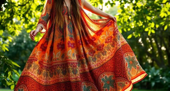
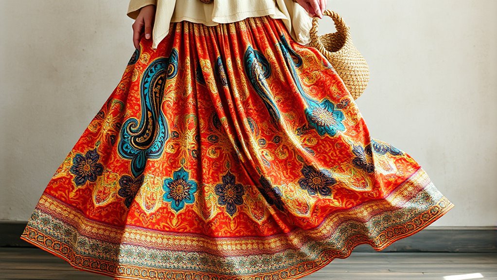
Combining Patterns: Floral, Paisley, and Geometric
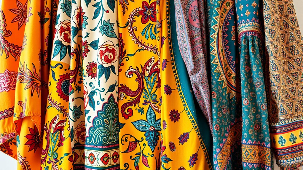
Combining floral, paisley, and geometric patterns can create a vibrant boho look, but it works best when these prints share a common color palette. To achieve harmony, consider these tips:
- Use a consistent color palette across floral, paisley, and geometric patterns to prevent visual chaos.
- Pair a floral top with a paisley scarf or geometric skirt to balance different patterns while keeping the look cohesive.
- Mix patterns of varying scales—small floral with large geometric designs—to add depth.
- Keep other elements simple with neutral or solid-colored accessories to anchor bold prints.
Focusing on one statement pattern per outfit ensures your mixing creates harmony rather than clutter. This approach makes your boho style feel intentional and polished.
Mixing Textures to Enhance Visual Interest

By mixing different textures within your boho outfits, you can create a mesmerizing sense of depth and tactile interest that elevates your overall look. Incorporate a variety of textures through layering, such as combining soft linen with rugged denim or suede, to add contrast and dimension. Wearing crochet vests over cotton dresses introduces tactile variety, enriching the boho aesthetic. Textured outerwear, like embroidered jackets or knit cardigans, instantly elevates simple ensembles with depth. Juxtaposing smooth, flowing fabrics with textured details like fringe or tassels enhances movement and visual dynamism. Accessories also play a key role; beaded jewelry paired with woven bags reinforce the layered, eclectic feel. Mixing textures keeps your outfits lively, interesting, and true to the free-spirited boho style. Engaging in personal development practices like mindfulness can also inspire more creative and confident styling choices. Additionally, exploring cultural influences from around the world can introduce fresh texture combinations to your wardrobe. Incorporating vetted global products such as unique textiles and artisanal craftsmanship can further elevate your boho look with authentic touches. Embracing a mindful approach to fashion encourages thoughtful layering and texture mixing that reflect your personal style and values. Remember that understanding textile diversity can help you choose the right fabrics to achieve harmonious and striking combinations.
Using Accessories and Details to Tie Colors Together

Accessories and details are powerful tools for unifying your boho look, especially when they incorporate multiple colors from your palette. They create visual links that tie different prints and hues together seamlessly. To achieve this, consider:
- Using accessories like scarves, jewelry, and belts that incorporate various colors from your wardrobe.
- Incorporating neutral tones, such as beige or metallic accents, to balance bold or clashing colors for a cohesive look.
- Choosing patterned accessories with subtle color repetition to reinforce your overall color scheme.
- Adding layering details like embroidery or beaded embellishments that echo hues in your clothing, enhancing color harmony.
These elements help create a polished, cohesive look by emphasizing color coordination and thoughtful layering, making every piece work harmoniously.
Seasonal Adaptations: Refreshing Your Boho Color Mix
To keep your boho style fresh throughout the year, adapting your seasonal color palette is essential. Swap bright, warm hues for cooler, muted tones like sage green, dusty blue, or charcoal during fall and winter. Incorporate seasonal prints with a cohesive color scheme by selecting patterns that feature similar shades, ensuring seamless print coordination. Layer lighter pastels over darker base garments for transitional weather, adding depth and versatility. Use accessories in seasonal colors—think burnt orange scarves or deep burgundy jewelry—to update your look without overhauling your wardrobe. Emphasize earthy tones in autumn and rich jewel tones in winter to maintain that authentic boho vibe year-round. These adjustments keep your outfits fresh, harmonious, and perfectly aligned with the seasons.
Tips for Creating Harmonious and Unique Outfits

Creating harmonious and unique boho outfits starts with selecting prints that share a common color palette; this guarantees your look is cohesive rather than chaotic. To achieve this, consider these tips:
- Mix bold prints with subtle textures like crochet or suede to add depth without clutter.
- Incorporate a balanced mix of warm and cool hues within your prints for versatility.
- Use solid-colored garments as neutral bases to let printed pieces stand out.
- Experiment with layering different print scales, such as small florals with large stripes, to add visual interest while maintaining harmony.
Frequently Asked Questions
How Can I Incorporate Metallic Accents Into My Boho Print Mixes?
You want to incorporate metallic accents into your print mixes, and it’s easier than you think. Start by adding metallic jewelry or accessories like bangles, earrings, or a statement belt to complement your prints. You can also choose metallic shoes or bags to add a touch of shimmer without overpowering your look. Just keep the hues balanced, and let the metallic pieces enhance your boho style effortlessly.
What Are Some Eco-Friendly Dye Options for Personalized Boho Garments?
Imagine vibrant, eco-friendly dyes blending seamlessly into your boho wardrobe. You can choose natural dyes like indigo, madder root, or turmeric, which come from plants and are biodegradable. These options let you personalize your garments while reducing environmental impact. By opting for these dyes, you create unique, sustainable pieces that reflect your style and values, making your boho look both beautiful and eco-conscious.
How Do I Balance Vintage and Modern Prints in One Outfit?
Balancing vintage and modern prints in one outfit can be fun and stylish. Start by choosing a dominant print, like a vintage floral, then add modern patterns, such as geometric shapes, as accents. Keep the color palette cohesive to avoid clashing. Mix different scales, like a large vintage print with smaller modern details, and use neutral accessories to tie the look together. This approach creates harmony between old and new.
Can I Mix Prints With Different Scale Sizes Effectively?
You can definitely mix prints with different scale sizes effectively. To do it well, start by choosing one dominant print and pairing it with a smaller or larger print that complements its colors. Keep the overall look balanced by sticking to a cohesive color palette. You might also break up the prints with solid accessories or layers, making sure each piece stands out without overwhelming the others.
What Color Combinations Work Best for Transitioning Between Seasons?
You want seamless seasonal progressions, so choose colors that harmonize and complement. Soft neutrals like beige, taupe, and cream act as versatile bases, blending easily with warmer hues like terracotta and mustard for fall, or cooler shades like sage and blush for spring. Incorporate layered textures and subtle prints to add interest without overwhelming. Stick to a cohesive color scheme, and you’ll effortlessly move between seasons with stylish ease.
Conclusion
By blending warm earth tones with vibrant hues, you turn your wardrobe into a canvas of artistic expression. Think of your outfits as a lively garden—each print, hue, and texture adding its own unique bloom. With a little layering and thoughtful accessories, you’ll craft looks that are both harmonious and uniquely yours. Embrace the boho spirit, and let your style flow freely like a colorful, endless sunset.