In boho interiors, color psychology plays a key role in shaping the mood you want to create. Warm earthy tones like terracotta and saffron evoke comfort, stability, and a connection to nature, while cool shades such as mint green and lavender promote relaxation and tranquility. Vibrant hues add energy and personality, especially when balanced with neutrals. Mixing textures and patterns enhances these effects. Keep exploring how different hues can transform your space and influence your mood.
Key Takeaways
- Warm earth tones like terracotta and saffron foster coziness, stability, and emotional well-being in boho spaces.
- Cool shades such as turquoise and sage promote relaxation, tranquility, and a calming atmosphere.
- Vibrant hues like reds, oranges, and yellows energize interiors and create lively focal points.
- Balancing bold colors with neutral tones prevents overwhelm and enhances overall harmony.
- Layering textures and natural materials amplifies the emotional impact of chosen hues.
Understanding the Role of Color Psychology in Boho Design
Color psychology plays a crucial role in shaping the ambiance of boho interiors by influencing how you feel in a space. When you choose colors thoughtfully, you tap into their emotional impact to create an environment that feels authentic and inspiring. In boho interiors, vibrant and earthy hues are used intentionally to evoke creativity, freedom, and cultural richness. Warm tones like terracotta and saffron foster comfort and energetic vibes, while cool shades such as turquoise and sage promote relaxation and tranquility. Understanding the psychological effects of these colors helps you craft spaces that boost mood, inspire individuality, and tell personal stories. Incorporating color associations with specific color palettes can further enhance the emotional atmosphere of your space. Recognizing the role of color psychology allows you to select hues that support your desired emotional responses. By strategically using color, you can achieve emotional harmony, making your boho space both dynamic and welcoming.
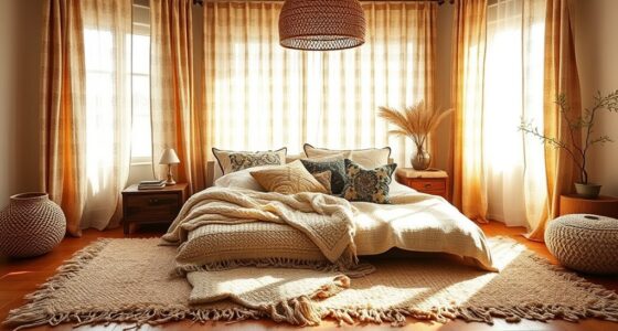
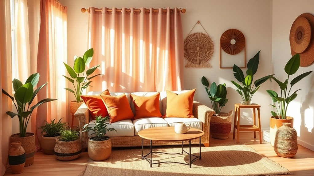
Warm Earth Tones and Their Emotional Impact
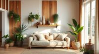
Warm earth tones like beiges, browns, and terracotta create a sense of stability and groundedness in your boho space. These colors foster a cozy, inviting atmosphere that encourages relaxation and mindfulness. By incorporating natural hues, you can evoke feelings of comfort and emotional well-being throughout your home. Incorporating color psychology principles can further enhance the mood you wish to create with these hues. Additionally, understanding the best beaches and their unique environments can inspire you to incorporate similar earthy elements into your decor, enhancing the overall ambiance. To deepen the impact of these colors, consider calibration techniques to ensure that your color palette appears vibrant and true to life under different lighting conditions. Exploring the interior design basics behind mood boards can help you visualize how these hues work together to achieve your desired atmosphere, especially when considering the portable camping options that include tools like tents and solar panels to create a cohesive outdoor space inspired by natural settings.
Grounding and Stability
In a boho interior, incorporating warm earth tones like beiges, browns, and terracottas creates a powerful sense of grounding and stability. These earth tones evoke feelings of connection to nature, fostering a cozy and secure environment. Their warm hues promote relaxation, helping you feel calm and centered in your space. By choosing these colors, you enhance the resilience and emotional balance of your home, making it a sanctuary from stress. Earth tones also support mindfulness, encouraging you to slow down and appreciate your surroundings. Using decorative planters made from natural materials can further reinforce this connection to nature and deepen the calming effect. Additionally, incorporating elements like flat iron bike accessories can add an adventurous touch that complements the natural palette without disrupting the overall harmony. When you incorporate these hues thoughtfully, you establish a foundation of stability that anchors your boho aesthetic while nurturing your well-being. Incorporating vetted products ensures quality and durability in your decor choices. This balance of color and comfort makes your space both inviting and emotionally supportive, especially when paired with smart bathroom technologies that promote relaxation and well-being. Moreover, embracing local regional resources can help you select authentic and sustainable decor options that resonate with your environment.
Cozy and Inviting Atmosphere
By incorporating earthy hues like beiges, browns, and terracotta into your boho space, you instantly create a cozy and inviting atmosphere. These warm earth tones evoke feelings of comfort and stability, making your home feel safe and grounded. Warm colors foster a sense of connection to nature, encouraging relaxation and tranquility. Studies show that earth-tone colors can reduce stress levels and promote a feeling of safety. Using these hues as your base palette allows you to layer eclectic textures and vibrant accessories typical of boho style, enhancing the inviting vibe. Incorporating natural materials such as wood, stone, and linen further deepens the connection to nature and enhances the warmth of the space. Strategically incorporating warm earth tones helps establish an emotional sense of belonging and calm—perfect for creating a cozy, welcoming environment that encourages relaxation and social connection. Additionally, embracing energetic alignment can amplify the soothing effects of your color choices by fostering a harmonious atmosphere. Introducing wall organization systems can help maintain a clutter-free environment, enhancing the overall sense of tranquility. Incorporating low light office plants can also enhance the calming effect of your space, adding a touch of greenery that thrives in subdued lighting conditions.
Calming Cool Shades for a Relaxed Atmosphere
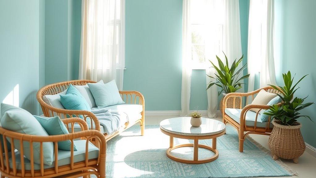
Cool shades like mint green, pastel blue, and lavender are essential in creating a relaxed boho atmosphere. These calming cool shades are among the most effective relaxing colors for boho interior design, promoting serenity and reducing stress. Incorporating soft, cool tones as wall colors or textiles helps create an airy, open feel that complements natural materials. Blue and green hues can even lower blood pressure and heart rate, fostering a tranquil environment. To deepen the soothing effect, consider:
- Layering pastel shades with natural textures
- Using muted tones in textiles and decor
- Balancing cool tones with warm accents
- Incorporating organic elements like wood and rattan
Additionally, understanding how eye patches can temporarily improve skin appearance highlights the importance of gentle, nourishing elements in creating a calming space. These strategies enhance the calming nature of your space, making it more inviting and peaceful. Incorporating color psychology principles can further optimize the mood and atmosphere of your boho interior, especially as recent AI security research emphasizes the importance of creating safe and harmonious environments. Exploring soaring and gliding concepts can inspire innovative ways to foster a sense of freedom and openness within your design.
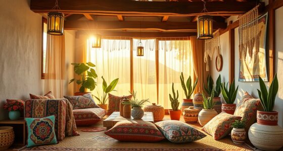
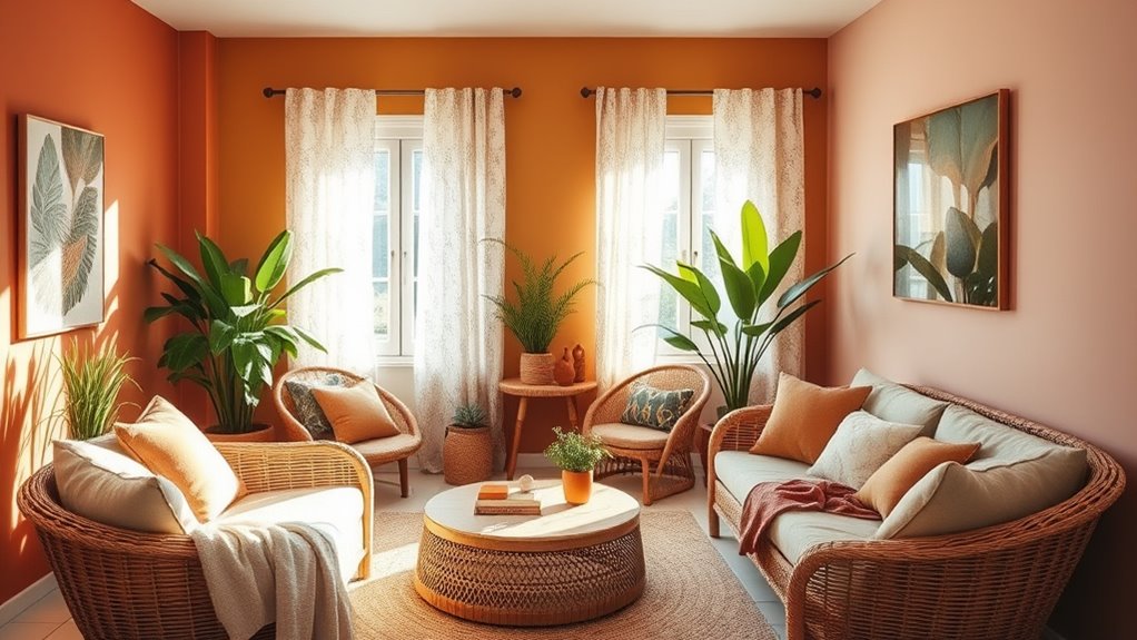
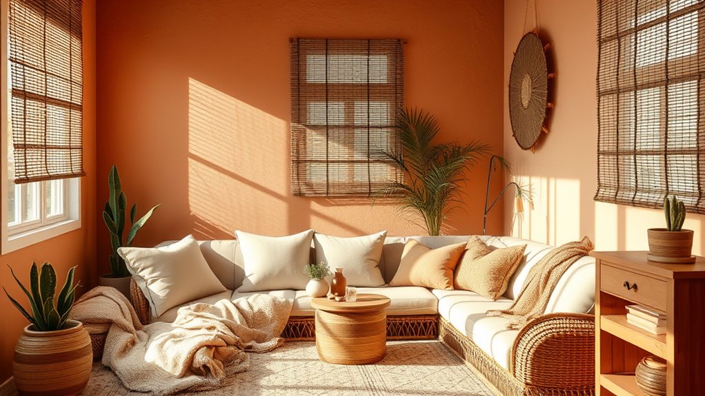
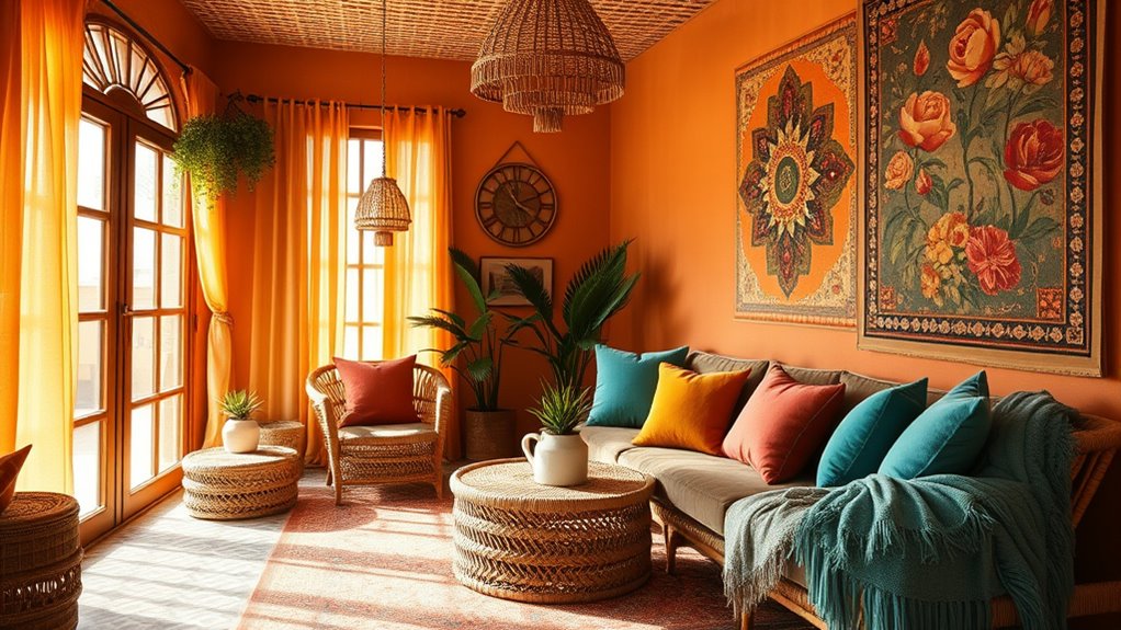
Adding Vibrancy: Bright and Bold Colors in Boho Spaces
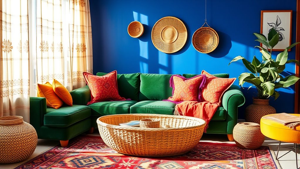
Bright and bold colors like fiery reds and sunny yellows energize boho spaces, making them feel lively and inviting. Combining vibrant hues with eclectic textile patterns or creating bold accent walls emphasizes your unique style. To keep the space balanced, pair these vivid colors with neutral tones, ensuring a dynamic yet harmonious environment. Incorporating color psychology principles can enhance the mood and atmosphere you wish to create with these vibrant choices. Choosing a name that reflects the lively and spirited nature of these colors, much like popular dog names, can also add a personal touch to your space. Additionally, understanding personality traits like traits of the alpha male or sanguine personality types can help in selecting colors that resonate with your personal energy and social style. Being aware of how investment risks can influence your choices encourages mindful styling that supports your overall well-being. Recognizing website performance metrics can also guide you in creating an engaging and effective interior design showcase.
Vibrant Color Combinations
Vibrant color combinations are essential for infusing boho interiors with energy and personality. By pairing bold hues like fiery reds, oranges, and yellows, you create a lively atmosphere that energizes the space. Using vibrant colors as focal points, such as colorful shelves or artwork, boosts visual interest and showcases your personal style. Balancing saturated colors with neutral earth tones or pastels prevents overwhelming the room while maintaining an energetic vibe. Incorporating contrasting colors, like turquoise and coral, emphasizes eclecticism and highlights your unique taste. To deepen the visual impact:
- Mix vibrant colors with neutral backgrounds
- Use contrasting hues for accent pieces
- Highlight key focal points with bold shades
- Balance saturation to avoid visual clutter
These techniques help craft a dynamic, engaging boho space full of life.
Bold Accent Walls
Adding a bold accent wall can dramatically transform your boho space by introducing a splash of vivid color that captures attention. Accent walls featuring vibrant colors like deep reds, bright oranges, or electric blues become focal points, bringing energy and dynamism to your room. These striking hues enhance visual interest, emphasizing the eclectic and free-spirited nature of boho design. Bright and bold colors on an accent wall can also stimulate creativity and encourage lively conversations, reflecting the vibrancy and individuality central to boho interiors. Incorporating saturated shades such as mustard yellow or turquoise balances layered textures and patterns, creating depth. Plus, vivid hues on accent walls can make smaller spaces feel more expansive and dynamic, adding a sense of depth and vibrancy to your overall decor. Color psychology plays a key role in selecting hues that evoke specific moods and atmospheres, helping you craft a space that truly resonates with your personality.
Eclectic Textile Patterns
Eclectic textile patterns in boho interiors introduce a lively mix of colors and designs that reflect your personality and creativity. By incorporating vibrant hues like fiery reds, oranges, and yellows, you create energetic and lively visual effects that draw attention. Juxtaposing colorful patterns with neutral backgrounds balances visual interest and keeps the space from feeling overwhelming. Layering multiple vivid colors and eclectic patterns amplifies the boho aesthetic, emphasizing a free-spirited style. To add depth, consider:
- Mixing bold, saturated textiles for a dynamic look
- Pairing contrasting patterns to create visual interest
- Using colorful textiles to evoke warmth and vibrancy
- Balancing vibrant hues with neutral elements for harmony
These eclectic patterns showcase your individuality while making your space vibrant and inviting.
Mixing Textures and Patterns to Enhance Color Effects
Mixing textures and patterns in boho interiors transforms a space into a visually rich and dynamic environment. By layering woven, embroidered, and chunky fabrics, you amplify the depth and vibrancy of your colors, making them appear more layered and lively. Incorporating patterns such as geometric, floral, and ethnic designs adds contrast and visual interest, enhancing the overall color effect. The interplay of textured surfaces and patterned textiles creates a sense of depth and intensity, making your space feel more engaging. Different material finishes—matte, glossy, or satin—also influence how light interacts with the colors, affecting the mood. Strategic layering balances bold hues with subtle shades, resulting in a cohesive, inviting boho aesthetic that feels both curated and harmonious.
Practical Tips for Incorporating Color Psychology Into Your Boho Interior
To effectively incorporate color psychology into your boho interior, start by selecting a balanced palette that reflects the mood you want to create. Earthy tones like beige, brown, and olive green foster a calming, grounded environment perfect for relaxation. Vibrant jewel tones such as turquoise, saffron yellow, and deep red inject energy, warmth, and cultural richness. Layer pastel shades like mint green, blush pink, and lavender to introduce softness and a whimsical, airy feel. Balance bold hues with neutral whites or creams to enhance visual harmony and emotional stability. Use ambient lighting strategically to amplify the psychological effects of your chosen colors. For added depth, consider texture and pattern layering, which complements your color palette and creates a cohesive, inviting space.
Frequently Asked Questions
What Are the Psychological Effects of Color in Interior Design?
The psychological effects of color in interior design directly influence your mood and behavior. You might feel calmer and more relaxed with blues and greens, or energized and motivated with reds and oranges. Neutral tones like beige and white can help you feel clearer and less stressed. Bright yellows can boost happiness, but too much might cause anxiety. Understanding these effects helps you choose colors that create the atmosphere you desire.
What Is the 3 Color Rule in Interior Design?
The 3 Color Rule is like a magic recipe for a stunning room. You pick three main colors: one dominant (covering 60%), a secondary (30%), and an accent (10%). This balance keeps your space from feeling chaotic, making it visually pleasing and harmonious. By sticking to these three hues, you create a cohesive look that’s simple yet impactful, ensuring your interior feels thoughtfully designed and inviting.
What Is the 60/30/10 Color Rule?
The 60/30/10 color rule helps you create balanced, harmonious spaces by dividing colors into proportions. You use 60% of the room with the dominant hue, like walls or floors, to set the overall tone. Then, add 30% with secondary colors for larger furniture or decor. Finally, incorporate about 10% with accent shades in accessories like pillows or artwork to add visual interest and complete your design.
What Is the 70/30 Rule in Interior Design?
You probably think designing a perfect space is impossible, but the 70/30 rule makes it simple. It’s a handy trick where 70% of your room features a dominant color or element, and 30% is for accents. This balance keeps your space looking stunning and harmonious, ensuring your main color shines without overwhelming. Stick to this rule, and your room will feel effortlessly curated and visually mesmerizing.
Conclusion
By thoughtfully choosing your colors, you paint your space with feelings—warm hues wrapping you in comfort, cool shades inviting calm, and vibrant tones sparking energy. Remember, your colors are the brushstrokes of your mood, transforming your boho interior into a sanctuary that beckons your soul. So, embrace the power of hues like an artist wielding a brush, and let your space tell the story of your unique vibe. Your perfect mood awaits just a color away.