
To create cozy, lived-in spaces using color theory, focus on warm, harmonious hues like soft reds, gentle oranges, and warm browns, which evoke comfort. Use analogous color schemes that blend seamlessly for a natural feel while adding subtle pops of contrasting colors carefully balanced with neutrals for interest. Understanding how colors influence mood helps you choose tones that promote relaxation and warmth. Keep exploring color relationships to craft inviting, harmonious environments your space will love.
Key Takeaways
- Use warm, soft hues like gentle reds, oranges, and browns to evoke comfort and coziness.
- Choose harmonious color schemes such as analogous palettes for a natural, soothing look.
- Incorporate muted blues and greens to promote calmness and relaxation in the space.
- Balance vibrant or contrasting colors with neutral tones to maintain warmth and inviting atmosphere.
- Apply color psychology to select hues that reinforce feelings of warmth, safety, and lived-in comfort.
Understanding color theory is vital for anyone interested in design, art, or visual communication. When creating cozy, lived-in spaces, mastering how colors work together can transform a room from plain to inviting. One of the key aspects to consider is color psychology, which explores how different hues influence mood and feelings. Warm tones like soft reds, gentle oranges, and warm browns evoke comfort and warmth, making your space feel welcoming. Cooler shades such as muted blues and gentle greens promote calmness and relaxation, perfect for areas meant for unwinding. By understanding how specific colors impact emotions, you can select a palette that enhances the cozy atmosphere you’re aiming for.
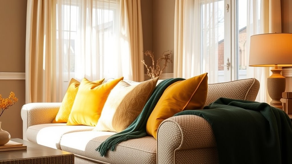
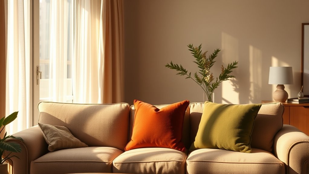
Another essential element is color harmony, which refers to how well colors blend to create a balanced and pleasing visual effect. When designing a cozy, lived-in space, you want to choose colors that complement each other without clashing. Harmonious color schemes, like analogous palettes—colors next to each other on the color wheel—offer a seamless flow that feels natural and soothing. For example, pairing soft yellow with warm orange creates a vibrant but harmonious look that radiates warmth. Complementary colors—those opposite each other on the color wheel—can add vibrancy and interest, but it’s best to use them sparingly in a cozy setting to avoid overwhelming the senses. Instead, balancing pops of contrasting hues with neutral tones helps maintain the inviting vibe.
You’ll find that understanding how different colors interact, based on their relationships in the color wheel, allows you to craft spaces that feel both harmonious and dynamic. Incorporating color psychology into your choices helps you tune into how you want your space to feel, whether it’s a quiet reading nook or a lively family room. Additionally, understanding color relationships can help you create visual interest and depth in your space. Combining this with an awareness of color harmony ensures that your color choices support the overall mood and style, creating a space that’s both comfortable and visually appealing.
Frequently Asked Questions
How Do I Choose Colors to Make a Space Feel More Inviting?
To make a space feel more inviting, start by choosing warm, soft colors that promote comfort. Use color accents like throw pillows or artwork to add personality, and keep a good color balance with neutral tones as a base. Incorporate varying shades to create depth and warmth. This combination invites relaxation, making your space feel cozy, lived-in, and welcoming for anyone who enters.
What Are the Best Color Combinations for a Cozy Atmosphere?
Did you know that muted palettes are shown to increase feelings of relaxation? To create a cozy atmosphere, combine complementary hues like soft blues and warm oranges or gentle greens with earthy browns. These combinations add balance and warmth, making your space inviting. Stick to muted tones for a soothing effect, and you’ll craft a welcoming environment perfect for relaxing or gathering with loved ones.
How Can I Use Color Psychology in Home Decor?
You can use the psychology of color to create a warm, inviting atmosphere in your home. Choose hues with emotional impact that match your desired mood—soft blues for calm, warm reds for energy, or gentle greens for balance. By understanding how different hues influence feelings, you can select decor and paint colors that foster comfort and coziness, making your space truly reflect your mood and personality.
What Colors Help a Small Space Feel Larger and More Open?
To make your small space feel larger and more open, choose light, neutral colors like whites, creams, or soft grays for walls. Add an accent wall with a subtle hue to create interest without overwhelming. Paint the ceiling a lighter shade than the walls to draw the eye upward and add a sense of height. These strategies work together to enhance openness and make your space feel more expansive.
How Do Lighting Conditions Affect Color Perception in a Room?
Imagine sunlight pouring through your windows, bathing your room in warm, golden hues that make colors pop vividly. Natural light brightens and alters colors throughout the day, making them appear more vibrant or softer. Artificial lighting, like warm or cool bulbs, can cast subtle or dramatic shifts, transforming the mood and perception of your space. You’ll notice how different lighting conditions highlight or mute certain tones, shaping your room’s cozy, inviting feel.
Conclusion
So, when you choose your colors, remember they’re more than just shades—they’re the heartbeat of your home. Like a warm embrace, they invite comfort and calm, weaving a tapestry of memories and moments. Each hue is a brushstroke on your personal canvas, shaping the atmosphere you crave. Embrace the dance of colors, let them whisper stories of coziness and life, turning your space into a sanctuary where every shade feels like home.