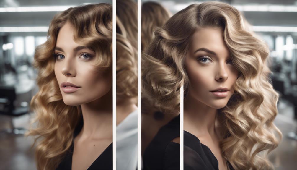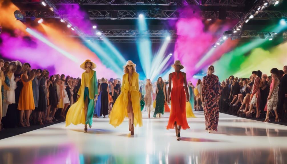
The color balance rule helps you avoid flat outfits by evenly distributing colors across your look. You should balance bold hues with neutrals or muted shades, using accents like accessories to add interest without overwhelming the outfit. Think of your wardrobe as a visual story, where every piece contributes to harmony. Mastering this rule keeps your outfits cohesive, lively, and intentional. Keep exploring to discover simple tips that can make your style truly stand out.

Get your wardrobe favorites delivered free with Prime
- Fast, free delivery on millions of items
- Prime Video, Amazon Music and more included
- Member-only deals all year
Key Takeaways
- Distribute bold and neutral colors evenly to create visual harmony and prevent overwhelming the outfit.
- Balance vibrant hues with muted or neutral tones for a cohesive, polished look.
- Use color accents strategically to add interest without disrupting overall harmony.
- Pair complementary colors to enhance visual appeal and emotional impact.
- Focus on consistent color distribution to maintain outfit balance and prevent flatness.
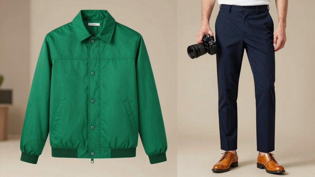
Have you ever wondered how to make your photos look more natural and visually appealing? The secret often lies in understanding the color balance rule, especially when it comes to outfits. When you master this, your wardrobe will feel more cohesive, and your photos will radiate a balanced, polished look. The first step is grasping the basics of color psychology, which influences how viewers perceive your outfit. Warm colors like reds, oranges, and yellows evoke energy and friendliness, while cool tones such as blues and greens create calmness and sophistication. Knowing how these colors interact helps you create outfits that communicate the mood you want.
Mastering color balance creates cohesive, natural outfits that radiate confidence and style.
Wardrobe coordination is all about balancing these colors thoughtfully. The color balance rule encourages you to distribute colors evenly across your outfit, preventing any one hue from overwhelming the overall look. For example, if you’re wearing a bold red top, balance it with neutral or muted bottom pieces like beige or gray. This avoids the outfit feeling too intense or flat. Instead, it pops just enough to catch the eye without causing visual fatigue. The rule also suggests using color accents—like accessories or shoes—to add interest without disrupting the harmony. When you incorporate these accents, make sure they complement the main colors and aren’t too overpowering.
Applying the color balance rule also involves considering your wardrobe coordination. Think of your outfit as a visual story, where each piece plays a part in creating harmony. If you choose a bright, vibrant shirt, pair it with more subdued pants or a skirt to anchor the look. Conversely, if you opt for softer, pastel hues, add a splash of a richer color to keep things lively. This balance keeps your outfit from feeling dull or overly chaotic. When you’re choosing clothing, pay attention to how colors work together. Use the rule as a guideline: distribute colors evenly across your body and accessories, and be mindful of the emotional impact of your color choices. Understanding color psychology can help you select hues that better communicate your intended mood. Additionally, considering visual harmony can enhance the overall coherence of your outfit.
Ultimately, mastering the color balance rule helps you craft outfits that feel cohesive and visually appealing. It’s about understanding the psychology behind colors and applying wardrobe coordination to create harmony. Whether you’re dressing for a casual day or a special event, balancing your colors ensures your style looks intentional and fresh. So next time you’re putting together an outfit, think about how each piece complements the others—this simple rule can make a big difference in how natural and put-together you appear.
Frequently Asked Questions
Can the Color Balance Rule Be Applied to Accessories?
Yes, you can definitely apply the color balance rule to accessories. When choosing accessory pairing, focus on maintaining color harmony with your outfit to create a cohesive look. Use complementary or analogous colors to enhance your ensemble without overwhelming it. Balancing bold statement pieces with subtle accessories ensures your outfit stays visually appealing, and the color balance rule helps prevent accessories from feeling out of place or flat, elevating your overall style effortlessly.
Does the Rule Work for All Skin Tones?
Yes, the color balance rule works for all skin tones because it’s based on color harmony principles that enhance any complexion. You can adapt the rule by choosing shades that complement your skin tone, ensuring your outfit feels balanced and flattering. Whether you have warm, cool, or neutral skin tones, applying these principles helps create harmonious looks that highlight your natural beauty and keep your outfits from feeling flat.
How Do Seasonal Colors Influence the Rule?
Surprisingly, seasonal colors greatly influence the rule, even though it seems straightforward. By embracing seasonal harmony and considering color temperature, you can make your outfits pop effortlessly. Warm tones boost energy, while cool shades soothe and balance. So, when you apply this rule, think about your seasonal palette. It’s the secret sauce that keeps your look vibrant, preventing flatness, and ensuring your outfit resonates perfectly with your natural hues.
Can This Rule Be Used for Monochrome Outfits?
Yes, you can definitely use this rule for monochrome outfits. Focus on creating monochrome harmony by selecting different shades and textures of the same color. Incorporate tonal contrast to add depth and interest, preventing your look from feeling flat. Play with light and dark shades within your chosen color to make your outfit more dynamic, ensuring it stays visually engaging while maintaining a cohesive, elegant appearance.
Is the Rule Suitable for Both Casual and Formal Wear?
Surprisingly, yes—this rule works for both casual and formal wear. You might think formal outfits demand strict color harmony, but adding intentional outfit contrast keeps your look lively. Casual styles benefit from this balance too, preventing flatness. It’s a clever way to elevate any outfit, regardless of occasion. By mastering this rule, you guarantee your ensembles always have the right mix of harmony and contrast, making you effortlessly stylish.
Conclusion
Now that you know the color balance rule, you’re equipped to turn any outfit from dull to dazzling. Remember, striking the right balance is like walking a tightrope—you don’t want to lean too far one way or the other. Trust your instincts, experiment with different shades, and don’t be afraid to step out of your comfort zone. With this rule in your back pocket, you’ll always have a winning look up your sleeve.
Fall Picks
fall essentials
As an affiliate, we earn on qualifying purchases.