Mastering color coordination starts with understanding the color wheel and basic relationships like complementary, analogous, and triadic schemes. Use neutral tones to simplify outfits and add depth with shades and tints of your colors. Balance bold hues with neutrals, and consider color psychology for mood. Incorporate patterns, accessories, and inspiration boards to create cohesive, stylish looks. If you keep exploring, you’ll find easy ways to match and elevate your wardrobe effortlessly.
Key Takeaways
- Use the color wheel to identify complementary, analogous, and triadic color schemes for harmonious outfit combinations.
- Incorporate shades and tints within monochromatic outfits to add depth and sophistication.
- Balance bold colors with neutral tones to create visually appealing and versatile looks.
- Apply color psychology and seasonal analysis to select flattering and mood-appropriate hues.
- Use accessories and color blocking techniques to enhance outfit coordination and visual interest.
Understanding the Color Wheel and Basic Color Relationships
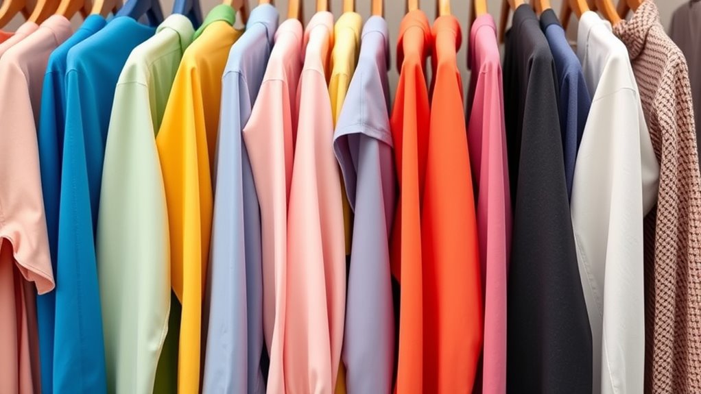
The color wheel is a fundamental tool that helps you understand how colors relate to each other. It forms the basis of color wheel fundamentals and is essential for mastering basic color theory. By familiarizing yourself with the wheel, you can identify harmonious color combinations, such as complementary, analogous, and triadic schemes. Complementary colors sit opposite each other on the wheel, creating vibrant contrasts when paired. Analogous colors, which are next to each other, produce a harmonious, cohesive look. Triadic schemes involve three colors evenly spaced around the wheel, offering balanced vibrancy. Understanding these relationships allows you to make confident choices when coordinating your wardrobe, ensuring your outfits are visually appealing and balanced. Mastering the color wheel is your first step toward stylish, coordinated looks. Additionally, knowing about family photoshoot fails can inspire you to choose colors that avoid unintentional distractions or funny mishaps during special photo sessions. Moreover, understanding color harmony principles from color wheel fundamentals can help you select combinations that enhance your overall style. You can also apply positive energy principles to boost your confidence and radiate style in your outfit choices.
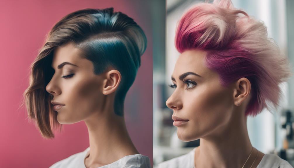
The Monochromatic Approach: Playing With Shades and Tints
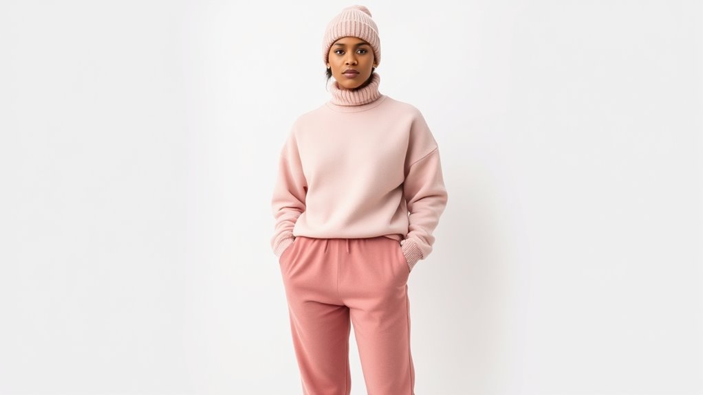
Using different shades of the same color adds depth to your look, making it more interesting and dynamic. Tints soften your outfit, giving it a gentle, sophisticated feel. Adding accessories in various shades and tints completes your monochromatic style with subtle contrast. Incorporating color accuracy in your wardrobe choices can enhance the overall harmony and visual appeal of your outfits.
Varying Shades for Depth
Adding depth to your color palette involves playing with different shades and tints within the same hue. Shading techniques help you create visual interest by layering darker and lighter versions of a color, giving your outfit a richer look. For example, pairing a deep navy with a lighter sky blue adds dimension and keeps the look cohesive. You can also incorporate color blocking by combining different shades of the same color in bold, defined sections, which emphasizes the variations and adds a modern edge. This approach allows you to stay within a monochromatic scheme while still creating contrast and depth. Experimenting with shades makes your wardrobe more dynamic and versatile, giving you endless opportunities to elevate simple outfits effortlessly. Additionally, understanding how to match colors effectively can further enhance your overall look and ensure harmony within your ensemble. Recognizing different color harmony principles can help you create balanced and stylish outfits with ease, and exploring tint and shade variations can add even more complexity and interest to your outfits.
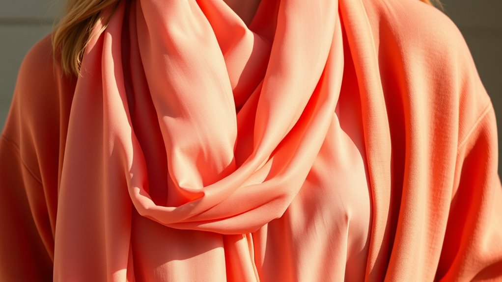
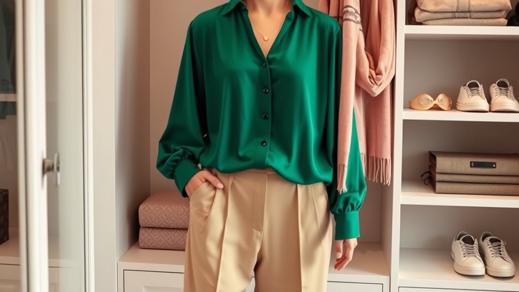
Tints for Softness
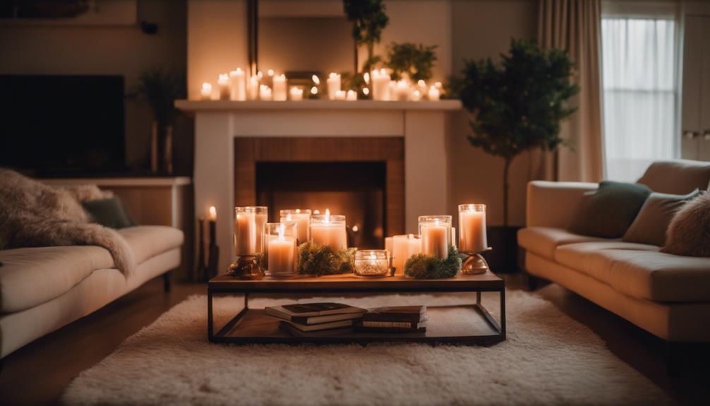
To achieve a softer, more delicate look within a monochromatic palette, incorporating tints—colors mixed with white—can be your best tool. Tints create a subtle, airy effect that enhances pastel palettes and adds depth to your outfit through soft layering. By choosing lighter shades, you can craft a gentle, cohesive appearance that’s easy on the eyes. Tints also allow for more versatile styling, making it simple to blend different pieces seamlessly. Whether you’re layering a pale pink blouse over a slightly darker skirt or pairing a mint green top with a softer shade, these variations bring harmony and elegance. Embracing tints helps you achieve a refined, understated look that’s perfect for any occasion where softness and sophistication are key. Understanding color coordination techniques can further elevate your styling skills for cohesive outfits.
Monochrome With Accessories
Building on the softness achieved through tints, incorporating accessories in a monochromatic outfit amplifies your look’s depth and dimension. Accessories like jewelry, scarves, or belts in varying shades or tints enhance your ensemble, leveraging color psychology to evoke specific moods. For example, deep reds suggest confidence, while pastel blues promote calmness. Seasonal color analysis guides you to select accessories that complement your natural undertones, creating harmony. Use this table to explore options:
| Shade/Tint | Mood/Seasonal Suitability |
|---|---|
| Light Mint | Invigorating, Spring |
| Deep Burgundy | Sophisticated, Autumn |
| Soft Lavender | Calm, Winter |
| Bright Coral | Energetic, Summer |
Additionally, understanding color harmony principles can help you balance your outfit and create visually pleasing combinations. Incorporating the use of complementary colors can further enhance your overall look, ensuring each piece works harmoniously together. Recognizing how contrast and balance influence visual appeal allows you to craft outfits that are both stylish and cohesive.
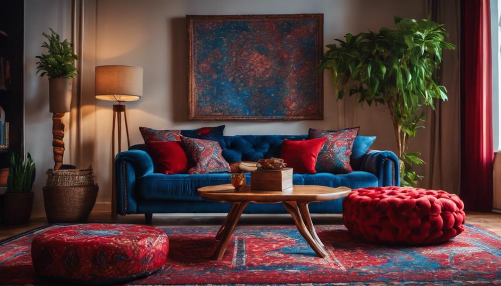
Complementary Colors: Creating Vibrant and Bold Looks
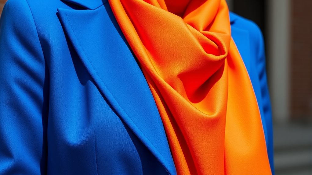
Complementary colors create eye-catching, vibrant outfits that turn heads. When you combine bright color combos, it’s important to balance the intensity so your look stays bold without overwhelming. Mastering this contrast will help you make confident, striking style choices. Paying attention to color harmony can further enhance your wardrobe’s overall cohesion and appeal. Additionally, understanding how color contrast affects visual impact can help you achieve more dynamic and balanced outfits. Exploring personal style can also assist in selecting complementary combinations that reflect your unique taste while maintaining harmony.
Bright Color Combos
Bright color combinations instantly grab attention and create a striking visual impact. To achieve this, try color blocking with bold hues like electric blue paired with fiery orange or vivid pink with lime green. These combinations emphasize contrast and make your outfit stand out. Don’t shy away from pastel combinations; soft pinks and baby blues can also create vibrant, eye-catching looks when combined thoughtfully. Use complementary colors to maximize the boldness—think red and green or blue and orange—for a dynamic effect. Keep in mind that balancing these bright shades is key to avoiding overwhelm. When done right, bright color combos make your wardrobe pop and showcase your confidence. Experiment with different pairings to discover what energizes your style and keeps your look fresh and lively. Incorporating color coordination techniques can help you refine your choices and create harmonious, eye-catching outfits. Understanding color theory can further enhance your ability to mix and match effectively, especially when considering interior color schemes for a cohesive overall aesthetic.
Balancing Intensity
Pairing bold, contrasting colors like red and green or blue and orange creates vibrant, eye-catching outfits, but it’s easy to go overboard and look overwhelming. To balance intensity, use color blocking techniques to distribute these hues evenly, preventing one shade from overpowering the other. Consider your seasonal color analysis to select complementary colors that suit your skin tone and personal palette, making bold contrasts more harmonious. If you want a more subdued look, tone down one color with a neutral or softer shade. Mixing vivid hues with muted tones helps create visual interest without overwhelming the eye. Being aware of electric bike price ranges can also influence your overall wardrobe budget, ensuring style choices align with your financial plans. Additionally, understanding automotive water spot removers can help maintain your vehicle’s appearance, reflecting a keen eye for detail in your overall style. By thoughtfully balancing color intensity, you’ll achieve striking, fashion-forward outfits that draw attention without feeling chaotic.
Analogous Colors: Achieving Harmonious and Cohesive Outfits
When you choose colors that are next to each other on the color wheel, you create a naturally harmonious look. These are called analogous colors, and they help you achieve a cohesive outfit without clashing. Using the color wheel as your guide, pick shades that sit side by side for a soft, blended effect. This approach enhances color harmony, making your outfit feel balanced and pleasing to the eye. For example, pairing blue with teal or yellow with orange creates a seamless progression between tones. Keep in mind that choosing one dominant color and adding subtle accents from neighboring hues keeps your look fresh and coordinated. Incorporating color coordination techniques can further elevate your outfit choices and ensure a well-put-together appearance. Being mindful of visual balance when combining analogous colors can help you create outfits that are both stylish and effortlessly put together. Additionally, understanding how nutritional value of juices relates to overall health can inspire you to incorporate vibrant, healthy colors into your wardrobe and lifestyle choices.
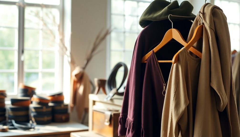
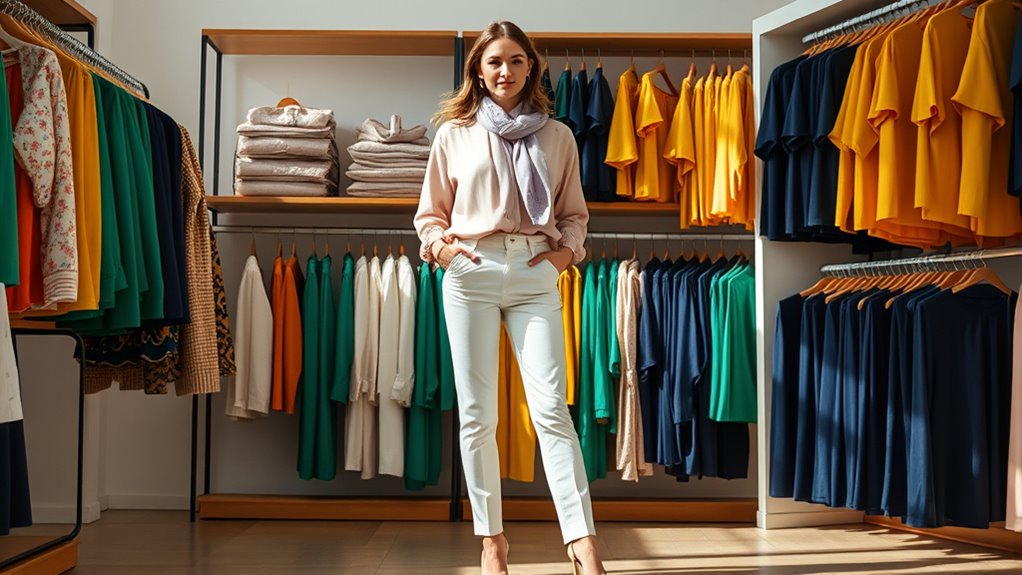
Neutrals and How They Simplify Color Matching
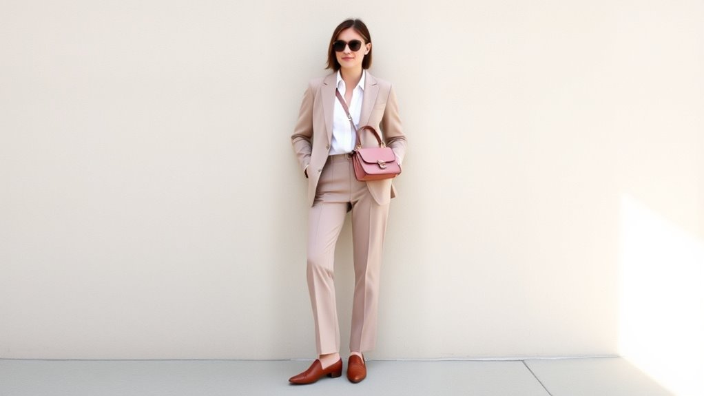
Neutrals are powerful tools that simplify color matching by providing versatile, understated options that effortlessly complement other hues. Neutral tones like beige, gray, black, and white serve as versatile basics in your wardrobe, making it easier to create balanced outfits. These shades act as a canvas, allowing you to pair bold colors or patterns without clashing. Neutrals also add sophistication and flexibility, so you can mix and match pieces confidently. Whether you’re dressing for a casual day or a formal event, incorporating neutral tones reduces the stress of coordinating colors. They help you achieve a cohesive look with minimal effort, making your wardrobe more functional and stylish. Ultimately, neutrals streamline your outfit choices and elevate your overall style. Many neutral shades are also popular in Self Watering Plant Pots, offering aesthetic appeal that complements various decor styles.
Using Color Palettes and Inspiration Boards

Using color palettes and inspiration boards can transform your approach to coordinating colors by providing a clear visual framework. These tools help you see how different shades work together, making it easier to create cohesive outfits. By exploring color psychology, you can choose hues that evoke specific moods or feelings, enhancing your overall style. Seasonal color analysis further refines your choices by identifying colors that complement your skin tone and personal coloring, ensuring your wardrobe feels harmonious. Inspiration boards allow you to gather images, fabric swatches, and color combinations from magazines, online sources, or personal photos. This visual reference streamlines decision-making and helps you develop a more confident, intentional wardrobe, rooted in understanding how colors interact and influence your appearance.
Tips for Balancing Bright and Neutral Colors
Balancing bright and neutral colors creates a harmonious and eye-catching outfit, but it requires intentional placement and proportion. One effective tip is to use color blocking, pairing a bold, bright hue with a neutral like white, beige, or gray. This technique keeps the look vibrant without overwhelming your senses. For a softer approach, try pastel pairing—combine pastel shades with neutral tones for a subtle, sophisticated balance. When incorporating bright colors, keep most of your outfit neutral, adding pops of color through accessories or small clothing pieces. Conversely, if you want the brights to stand out, choose a neutral base and add bright accents strategically. Remember, the goal is to create visual harmony, so practice proportion and placement to avoid an overly busy appearance.
Incorporating Patterns and Prints With Solid Colors
Incorporating patterns and prints with solid colors can add visual interest and personality to your outfit, but it’s important to strike the right balance. To master pattern mixing and print pairing, consider these tips:
- Start with a neutral base, like a solid top or bottom, to let the print stand out.
- Choose one statement print and pair it with subtle, solid-colored accessories.
- Keep the scale of patterns varied—pair large prints with smaller ones to avoid clashing.
- Use color coordination to tie patterns and solids together seamlessly.
Practical Styling Tips for Everyday Color Coordination

To achieve effortless everyday color coordination, start with a simple color palette that suits your skin tone and personal style. Focus on a few versatile shades that mix well and reflect your vibe. Accessorizing with color is a great way to add interest—try bold bags, scarves, or jewelry that complement your outfit. Seasonal color matching also helps keep your look fresh; lighter pastels work in spring, while deeper hues suit fall. Keep balance in mind: if you wear a vibrant top, pair it with neutral bottoms. When in doubt, stick to monochrome or analogous color schemes for easy, put-together outfits. These practical tips make daily styling simple, ensuring you look polished without overthinking your choices.
Frequently Asked Questions
How Do I Choose Colors for Different Skin Tones?
When choosing colors for different skin tones, you should consider skin tone palettes to find flattering shades. For warm skin tones, go for earthy hues like browns and oranges, while cool tones shine with blues and purples. Use color contrast tips—pairing contrasting but harmonious colors makes your look pop. Trust your instincts, and experiment with different shades to discover what enhances your natural glow!
What Accessories Complement Colorful Outfits Best?
Perfectly pairing accessories boosts your bold outfits. Focus on jewelry pairing that adds sparkle without stealing the show, like delicate necklaces or statement earrings. Shoe coordination is key—match your shoes to a dominant color or keep it neutral for versatility. Play with patterns or textures to add interest. Remember, the right accessories should enhance your colorful look, making it fun and fashionable without feeling overwhelming.
How Can I Transition Colors Between Seasons?
When shifting colors between seasons, you should focus on seasonal color palettes that suit the weather and mood. Incorporate fabrics with textured finishes like wool or silk to add depth. Mix and match lighter shades for spring and summer with darker, richer tones for fall and winter. Layering pieces in complementary colors helps you smoothly shift your wardrobe, making your outfits stylish and seasonally appropriate without needing a complete overhaul.
What Are Some Quick Tips for Color-Matching on Busy Mornings?
On busy mornings, streamline your color-matching by relying on color wheel basics and monochromatic schemes. Quickly pick a dominant color, then match accessories and layers within the same hue for instant harmony. Use simple rules like pairing complementary colors or sticking to neutral shades. This approach saves time, reduces stress, and guarantees your outfit looks coordinated effortlessly. Embrace these tips for a polished look, even when you’re in a rush.
How Do I Match Colors for Formal Versus Casual Occasions?
When matching colors for formal or casual occasions, you can use color wheel fundamentals to guide your choices. For formal events, stick to monochromatic schemes or subtle neutrals for an elegant look. For casual outings, experiment with complementary or analogous colors for a relaxed vibe. Knowing the basics helps you create balanced outfits, ensuring your look suits the occasion without overthinking.
Conclusion
Did you know that wearing coordinated colors can boost your confidence and even improve your mood? By understanding basic color relationships and experimenting with shades, neutrals, and patterns, you can effortlessly create stylish, cohesive outfits. Remember, over 80% of fashion experts agree that well-matched colors make your look more polished. So, have fun exploring your wardrobe and applying these simple tips—you’ll be surprised at how easy it is to elevate your style every day.