
In boho clothing, smart print placement and proportion help you create balanced, eye-catching outfits. Focus on pairing smaller, delicate patterns with larger, bolder ones to avoid visual clutter. Place prints thoughtfully—like a patterned scarf over a solid top or a printed vest to highlight certain areas—so they enhance your look without competing. Balancing scale and contrast guarantees your style looks cohesive. Keep exploring techniques to master confident print mixing and elevate your boho outfits.
Key Takeaways
- Strategically place bold prints near the waist or neckline to draw attention and balance proportions.
- Mix small, delicate patterns with larger ones to create visual interest without overwhelming the outfit.
- Use solid-colored accessories to break up busy prints and maintain visual harmony.
- Ensure prints are proportioned to your body shape, emphasizing features like the waist or shoulders.
- Layer prints thoughtfully, balancing scale and contrast to avoid visual clutter and achieve a cohesive boho look.
Have you ever wondered how the strategic placement and proportion of prints can transform your boho wardrobe? It’s all about mastering print balance and print layering. When you know how to arrange prints thoughtfully, your outfits become more cohesive and visually appealing, allowing your personality to shine through effortlessly.
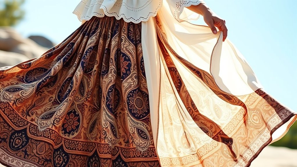
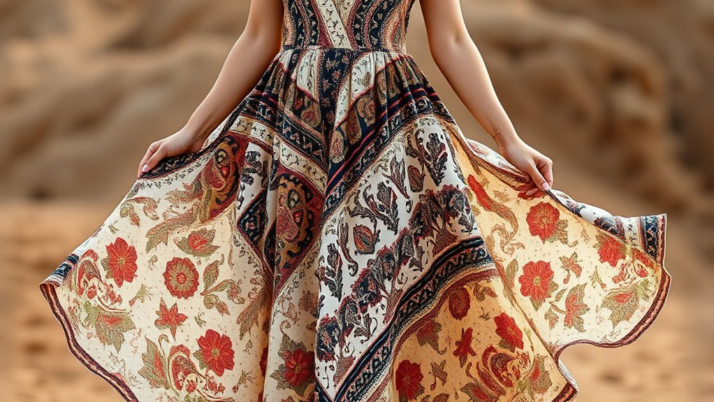
Print balance is key. You don’t want your look to be overwhelmed by too many competing patterns or, conversely, too plain without enough visual interest. Think of print balance as a dance—each pattern should complement the others without clashing. If you’re wearing a busy, patterned top, balance it with solid-colored bottoms or accessories to avoid overwhelming the eye. Conversely, if your skirt or dress features a bold print, keep your top simple and subdued. This contrast helps your outfit feel intentional rather than chaotic. As you get comfortable with print balance, you’ll notice how it elevates your overall style, making each piece work together harmoniously rather than fighting for attention.
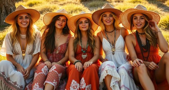
Print layering is another essential technique. Layering isn’t just about stacking clothing; it’s about combining different prints and textures thoughtfully. Start with a base piece—like a printed blouse or a patterned maxi dress—and add a jacket, scarf, or accessories that introduce new patterns. When doing this, keep in mind the scale of the prints. Pair small, delicate patterns with larger, bolder ones to create visual interest without clutter. You might layer a floral scarf over a striped top or add a patterned vest over a printed dress. The key is to maintain a sense of cohesion, so the prints don’t compete but instead enhance each other. Additionally, understanding print placement can help you highlight your best features and create a balanced look. As you experiment with print layering, you’ll discover how to mix and match patterns confidently, giving your boho outfits depth and personality.
Frequently Asked Questions
How Does Print Placement Affect Overall Boho Outfit Balance?
Print placement directly impacts your boho outfit balance by creating visual symmetry and harmony. When prints are strategically placed, they guide the eye smoothly across your look, preventing it from feeling overwhelming or unbalanced. Focus on maintaining color harmony and consider symmetry in print placement—like balanced patterns on both sides—to enhance your overall style and keep your outfit cohesive and effortlessly chic.
Which Print Proportions Are Most Flattering for Different Body Types?
Beauty is in the eye of the beholder, so choose print proportions that highlight your body shape. If you have an hourglass figure, opt for balanced print contrast on top and bottom. For pear shapes, focus on bold prints on your upper body to draw attention upward. Rectangular shapes benefit from varied print sizes to create curves. Remember, the right print proportion enhances your natural silhouette and boosts confidence.
Can Bold Prints Be Mixed Without Overwhelming the Look?
Yes, you can mix bold prints without overwhelming your look by layering bold prints thoughtfully. Start with one statement piece and add smaller, complementary patterns to create visual interest. Use contrasting colors or similar tones to keep the look cohesive. Balance large and small prints to avoid clutter, and focus on proportional placement. This approach guarantees your bold print combinations appear intentional and stylish, enhancing your boho vibe effortlessly.
What Are Common Mistakes in Print Placement for Boho Styles?
Think of your boho outfit as a symphony; if the print placement isn’t balanced, the melody gets lost. Common mistakes include neglecting print symmetry, making patterns look chaotic instead of harmonious. You also risk clashing colors or uneven distribution of prints, which distracts from the overall look. To avoid this, focus on coordinating colors and placing prints thoughtfully, creating a flow that feels natural and effortlessly stylish.
How Do Fabric Textures Influence Print Proportion Choices?
Your fabric texture, especially fabric weight, influences your print proportion choices because heavier fabrics can handle larger, bolder prints without overwhelming the garment. Lighter fabrics suit smaller, more delicate prints to avoid looking overly busy. When selecting prints, consider the print scale in relation to fabric texture; bigger prints work well on heavier, textured fabrics, while smaller prints suit lightweight, smooth materials for a balanced, harmonious boho look.
Conclusion
Think of your boho wardrobe as a beautiful garden, where print placement and proportion are the delicate blossoms and lush greenery. When you master these elements, your outfit blooms with harmony and charm, drawing eyes and admiration effortlessly. Embrace the art of balance, letting your prints dance across your clothing like petals swaying in the breeze. With this mindful approach, your style becomes a vibrant, thriving oasis that captures attention and reflects your free spirit.