
Mixing prints with pillows, rugs, and throws can create a warm, vibrant home. Start by choosing a cohesive color palette and varying pattern scales, like pairing large florals with smaller geometric designs. Balance bold patterns with calmer, subtle ones, and incorporate different textures to add depth. Keep the overall look harmonious by repeating key colors and themes. If you want to master stylish pattern play, there’s plenty more to discover below.
Key Takeaways
- Balance bold patterns with subtle designs by varying size, scale, and texture for visual harmony.
- Keep a consistent color palette across pillows, rugs, and throws to unify diverse prints.
- Mix geometric and floral patterns thoughtfully, using shared colors to prevent clashing.
- Incorporate different fabric textures and pattern scales to add depth and interest.
- Limit overall pattern choices and repeat key colors to create a cohesive, curated look.
Understanding Different Pattern Styles and Types
To effectively incorporate patterns into your home decor, it’s important to understand the different styles and types available. Geometric motifs feature clean lines, shapes, and symmetry, creating a modern, structured look that adds visual interest without overwhelming your space. Floral patterns, on the other hand, bring a softer, more organic feel with blooming designs and natural curves, perfect for adding warmth and charm. Recognizing these styles helps you choose the right pattern for each room, whether you want bold, eye-catching geometric shapes or delicate floral accents. Mixing these patterns thoughtfully can create a balanced and inviting environment. By understanding their characteristics, you can confidently select patterns that complement your decor, ensuring a harmonious and stylish home. Additionally, incorporating patterned accessories like pillows, rugs, and throws can enhance your decor and create a cohesive, lively atmosphere. Exploring different pattern styles can also inspire you to experiment with layering and contrast, making your space uniquely yours. Incorporating a variety of pattern types can help you achieve a dynamic and personalized look that reflects your individual taste.
Tips for Combining Patterns Without Clashing
Once you’ve identified different pattern styles, the next step is to combine them effectively without creating visual chaos. Understanding pattern psychology helps you choose prints that complement rather than compete. For example, mixing bold, busy patterns with calmer, subtle designs creates balance, preventing overload. Cultural influences also play a role; incorporating patterns inspired by different traditions can add depth and richness without clashing if you stick to a cohesive theme. Keep one pattern as the focal point, and use others to support it through shared colors or similar scales. Varying pattern sizes strategically—pairing large prints with smaller ones—also helps maintain harmony. Additionally, decluttering your patterned accessories can make your space feel more organized and intentional. Recognizing the importance of symbolism in patterns can help you select prints that evoke the desired mood or meaning. Incorporating cybersecurity considerations such as secure online shopping for home decor can help protect your personal information when sourcing new accessories. Trust your instincts, but remember that thoughtful pairing rooted in these principles guarantees your space feels lively yet cohesive.
Color Coordination and Palette Selection
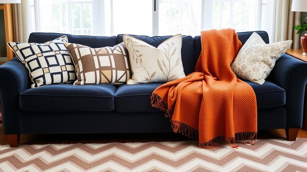
Choosing the right color palette is essential for creating a cohesive and inviting space when combining patterns. Start with a base color that ties everything together, such as a neutral or soft hue. Incorporate geometric motifs in pillows or rugs with shades that complement floral patterns—like pairing a navy geometric print with blush or pastel florals. Limit your palette to three or four main colors to avoid visual chaos. Use a consistent tone—warm or cool—to unify diverse prints. Accent colors can add interest, but keep them subtle to maintain harmony. Remember, the goal is to blend different patterns smoothly, so selecting a harmonious color scheme guarantees your space feels balanced, lively, and thoughtfully curated. Incorporating high-contrast designs can create visual interest while maintaining overall cohesion. To enhance the farmhouse aesthetic, consider how natural materials like linen and wood can influence your color choices and pattern combinations. Paying attention to color harmony helps in creating a unified look that is both vibrant and relaxing.
Balancing Bold and Subtle Prints
To create a balanced look, try pairing bright, bold prints with more muted, subtle patterns. Varying the scale and pattern size keeps the space interesting without feeling overwhelming. Neutral anchors, like furniture or walls, help tie everything together and prevent the mix from clashing. Incorporating AI-driven design tools can also assist in visualizing and refining your print combinations. Recognizing the importance of print scale can help you achieve harmony between different patterns and avoid visual clutter. Additionally, understanding how visual metrics influence perception can guide you in creating cohesive and appealing decor arrangements.
Pairing Bright With Muted
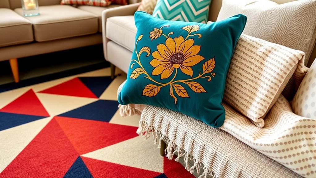
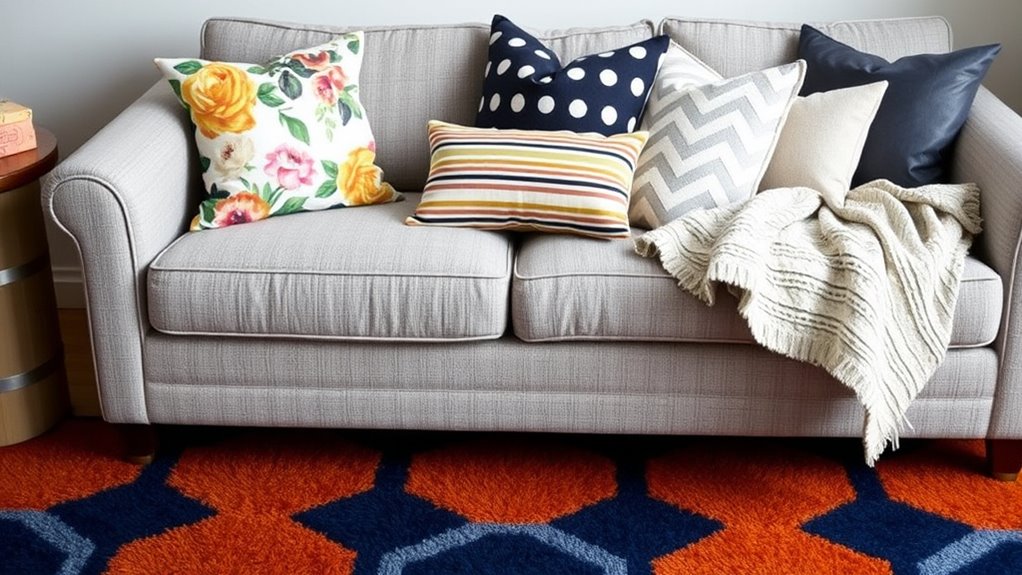
Balancing bold and subtle prints can create a striking yet harmonious look when decorating your home. To achieve this, use bright accents against muted backgrounds. For example, pair a vibrant, patterned pillow with a soft, neutral-colored sofa or rug. This contrast highlights the bright details without overwhelming the space. Keep the muted elements simple and understated, allowing your bold prints to stand out as focal points. Incorporate colors thoughtfully—bright accents like yellows, reds, or blues pop against calm, subdued tones such as beige, gray, or taupe. This approach creates visual interest while maintaining a sense of cohesion. Remember, the key is to let the muted background serve as a calm canvas that amplifies the energy of your bright accents. Additionally, understanding contrast ratio can help you select the right combination of colors to maximize visual impact and harmony. Cultivating an awareness of spiritual energy can also inspire more mindful choices in your decor, promoting a balanced and uplifting environment. Incorporating natural elements can further enhance the balance between bold and subtle patterns, creating a more inviting and harmonious space.
Varying Scale and Pattern
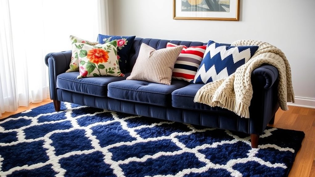
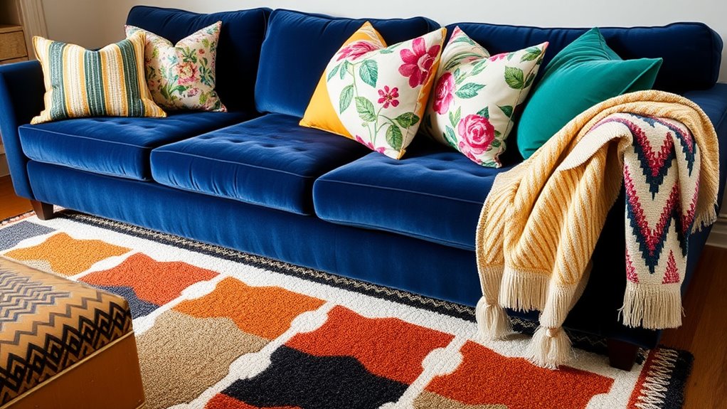
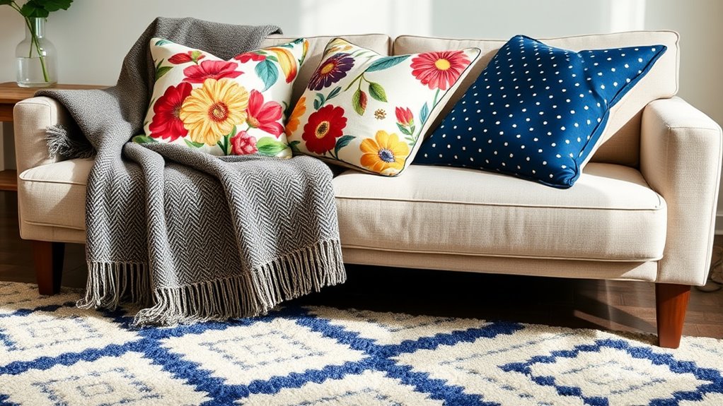
Mixing different scales and patterns adds depth and interest to your decor, preventing a space from feeling flat or monotonous. Start by pairing bold geometric motifs with smaller, subtle prints. For example, a large floral pattern on a rug can be balanced with smaller floral or geometric pillows. Incorporate a variety of pattern sizes—big, medium, and small—to create visual flow. Using a large, eye-catching print alongside more delicate designs keeps your space dynamic without feeling overwhelming. When mixing patterns, think about contrast and harmony. Bold geometric motifs can serve as statement pieces, while more muted, intricate floral patterns provide balance. This variation in scale and pattern keeps your decor lively, engaging, and well-balanced. Additionally, creating seamless indoor-outdoor flow can enhance the overall aesthetic by extending your pattern play to connected outdoor spaces. Being aware of support hours and schedules ensures you can plan your decor updates and shopping trips during optimal times. Consider also integrating plants, such as extra-large houseplants, to add natural texture and further enrich your layered pattern scheme.
Using Neutral Anchors
Have you ever felt overwhelmed by bold patterns that dominate a room? Using neutral anchors can help balance those striking designs. Choose furniture or large textiles in muted tones like beige, gray, or taupe to create a calm foundation. Incorporate geometric motifs in neutral shades to add subtle visual interest without competing with more vibrant patterns. Floral prints can also be grounded with soft, understated hues, letting their delicate details shine. These neutral anchors serve as a visual rest, allowing bold prints—like bright pillows or rugs—to stand out without overwhelming the space. For example, incorporating color coordination that reflect a refined or playful personality can add a charming touch to your decor. By balancing bold patterns with subtle neutrals, you craft a cohesive look that’s lively yet harmonious. This approach ensures your home feels inviting and thoughtfully styled, without feeling chaotic.
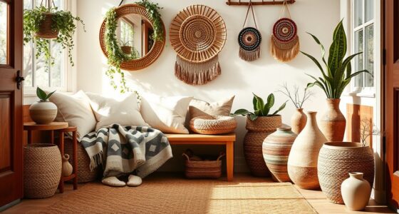
Layering Textures and Patterns for Depth
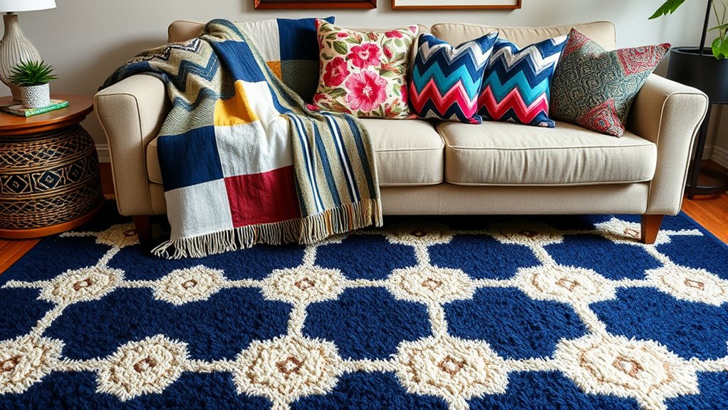
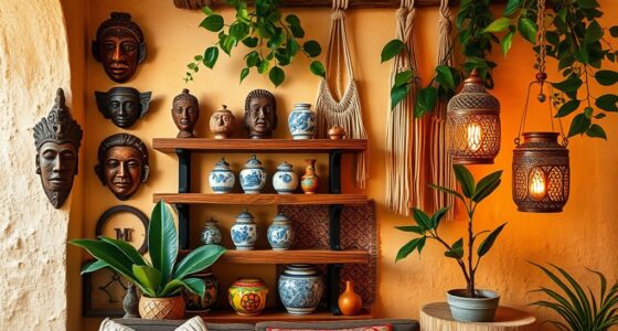
Layering textures and patterns is a powerful way to add depth and visual interest to your home decor. By combining different materials and prints, you create a rich, inviting atmosphere. Incorporate plush faux fur throws to add softness and luxury, balancing bold patterns with subtle textures. Velvet accents, such as cushions or curtains, introduce a tactile dimension that elevates your space. To enhance the layered look, consider how fandom influence can inspire unique decorative choices that reflect your personality and interests. Additionally, understanding the types of honey and their cultural significance can inspire subtle thematic accents or color palettes inspired by natural hues. – Mix patterned pillows with solid-colored throws – Use rugs with varied textures and intricate designs – Incorporate metallic or matte finishes for contrast – Combine different fabric weights, like lightweight linen with heavier velvets – Pay attention to emotional connection between patterns and textures to foster a cozy ambiance
This approach keeps your decor dynamic, sophisticated, and inviting, encouraging your space to feel both curated and cozy.
Practical Examples of Pattern Pairings in Living Spaces
You can create a cohesive look by choosing coordinated color schemes that unify different patterns. Contrasting patterns, like florals with stripes, add visual interest without clashing. Layering textured fabrics, such as throws and cushions, brings depth and comfort to your living space. Incorporating pattern recognition techniques can help you select and pair prints more effectively.
Coordinated Color Schemes
Coordinated color schemes can transform a living space by seamlessly blending patterns to create a cohesive and inviting atmosphere. By choosing matching color palettes, you establish harmony across different prints, making the room feel unified. Pattern repetition reinforces this cohesion, guiding the eye smoothly from one element to another. To elevate your decor, consider these strategies:
- Use a consistent color palette across pillows, rugs, and throws
- Incorporate pattern repetition with similar shapes or motifs
- Mix subtle variations within the same color family
- Balance bold patterns with more subdued hues for sophistication
This approach guarantees your space feels thoughtfully curated, where patterns complement instead of compete, resulting in a polished and comfortable environment.
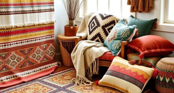
Contrasting Pattern Combinations
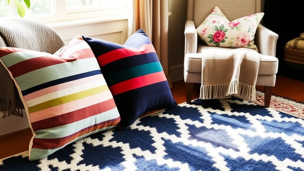
Contrasting pattern combinations can add visual interest and energy to your living space when paired thoughtfully. One effective approach is balancing geometric harmony with floral contrasts. For example, combine a bold geometric rug with floral pillows to create a lively yet cohesive look. The geometric pattern provides structure, while the floral adds softness and a touch of nature. Keep the scale in mind; pairing large-scale patterns with smaller, intricate ones prevents overwhelming the space. Use neutral backgrounds to anchor the mix, allowing the patterns to stand out without clashing. This contrast sparks visual intrigue and keeps the room dynamic. Remember, the key lies in maintaining harmony through thoughtful pairing, ensuring each pattern complements the other without competing.
Layering Textured Fabrics
Layering textured fabrics introduces depth and richness to your living space, building on the visual interest created by pattern contrasts. By combining different textures, you enhance the sense of fabric blending, making your room feel cozy yet dynamic. Focus on achieving textural contrast through contrasting materials like velvet, linen, and knits. This adds visual complexity without overwhelming the space.
Consider these ideas:
- Mix a plush velvet pillow with a rough-woven throw
- Layer a silky rug over a textured jute one
- Pair a smooth silk cushion with a chunky knit blanket
- Use varied fabric textures in curtains, pillows, and upholstery
This approach creates a sophisticated, inviting environment by thoughtfully balancing different fabrics and textures, elevating your interior design with tactile interest.
Maintaining a Cohesive Look While Mixing Prints
While mixing prints can seem intimidating, maintaining a cohesive look is entirely achievable with a few simple strategies. Focus on balancing pattern origin—combine prints from similar themes or styles to create harmony. Consider fabric texture; pairing textures that complement each other prevents the space from feeling chaotic. Stick to a consistent color palette, which helps unify different patterns even when their designs vary. Vary the scale of your prints—mix large and small motifs—to add visual interest without overwhelming the eye. Limit your overall print choices to prevent clutter, and repeat a key color throughout the space to tie everything together. By paying attention to fabric texture and pattern origin, you’ll create a curated, harmonious look that showcases your personality.
Frequently Asked Questions
How Do I Choose the Right Patterns for Small Spaces?
When choosing patterns for small spaces, focus on pattern scale and color harmony. Opt for smaller, subtle prints to avoid overwhelming the room, making it feel more open. Stick to a cohesive color palette so the patterns complement each other rather than clash. This balance creates visual interest without sacrificing space. By thoughtfully selecting pattern scale and maintaining color harmony, you’ll make your small space feel inviting and well-designed.
What Are Common Mistakes to Avoid When Mixing Prints?
When mixing prints, avoid common mistakes like clashing patterns or ignoring pattern scale. Use coordination tips, such as balancing busy prints with simpler ones to create harmony. Pay attention to pattern scale—pair large prints with smaller ones to prevent overwhelming your space. Stick to a cohesive color palette to keep the look unified. This approach helps you create a stylish, well-balanced room without visual chaos.
Can Pattern Mixing Work With Minimalist Interior Styles?
Yes, pattern mixing can work beautifully with minimalist interiors if you incorporate monochrome accents and bold statement pieces. You can add visual interest by layering subtle patterns with clean lines, creating contrast without overwhelming the space. Focus on a limited color palette, and let a few bold prints stand out. This approach keeps your minimalist style intact while adding texture and personality through strategic pattern play.
How Do Seasonal Changes Affect Pattern Selection?
Seasonal changes influence your pattern choices by shifting your focus to seasonal color palettes and texture variation. During colder months, opt for cozy, textured patterns in warm hues, while spring and summer call for lighter, vibrant prints. You naturally adapt your decor to reflect the season’s mood, making your space feel fresh and aligned with the time of year. Embracing these changes keeps your home lively and seasonally appropriate.
Are There Specific Patterns Suited for Children’s Rooms?
When choosing patterns for children’s rooms, you should focus on color coordination and pattern scale. Bright, lively colors work well, but guarantee they complement each other to avoid visual clutter. Opt for smaller-scale patterns on items like bedding or curtains, which create a balanced look. Larger patterns can be used as accent pieces. This approach keeps the space playful yet harmonious, making it welcoming and stimulating for kids.
Conclusion
Now that you’ve mastered mixing patterns with pillows, rugs, and throws, you’re ready to create mesmerizing, cohesive spaces. Play with proportions, pair bold with subtle, and balance bright with neutral. With confidence, combine colors and textures to craft a charming, chaotic charm. Remember, your unique style shines when you blend, balance, and boldly break the rules. So, step into your space and showcase your stunning, sophisticated sense of style with seamless pattern play!