Colors in your space influence your mood and perception more than you might realize. Warm hues like red and yellow energize and create excitement, while cool tones such as blue and green promote calm and focus. Neutral shades provide a soothing backdrop, making rooms feel larger and more inviting. Understanding how neural responses and cultural meanings impact color choices helps you design spaces that boost well-being. Explore further to discover how to use colors effectively in your environment.
Key Takeaways
- Warm colors like red, orange, and yellow energize spaces and boost positive emotions, making them ideal for social areas.
- Cool hues such as blue and green promote calmness, relaxation, and focus, suitable for bedrooms and workspaces.
- Neutral tones create versatile, soothing environments that enhance space perception and serve as calming backgrounds.
- Bright, saturated colors increase energy but should be balanced to prevent sensory overload and maintain harmony.
- Understanding cultural color symbolism and neural responses helps in selecting room colors that improve mood and spatial harmony.
The Science Behind Color Perception and Emotion
Colors influence your emotions in ways you might not realize, and scientists have uncovered how our brains process these visual signals. The field of color perception science explores how the brain interprets different hues and their effects on mood. Color symbolism plays a key role, as certain colors are linked to specific feelings—red often signals energy, while blue evokes calm. When you see a color, your brain quickly associates it with past experiences and cultural meanings, shaping your emotional response. This process isn’t random; it’s rooted in complex neural pathways that assign significance to colors. Understanding how your brain perceives color helps explain why certain shades can lift your spirits or make you feel more relaxed, revealing the power of visual stimuli on your emotional state. Additionally, concepts from Personal Development such as mindfulness can enhance your awareness of how colors impact your mood and overall well-being. Recognizing the neural pathways involved in color perception can empower you to intentionally choose room colors that foster positive feelings and environments.
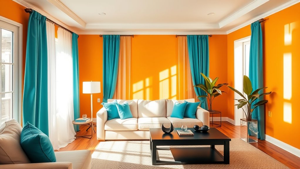
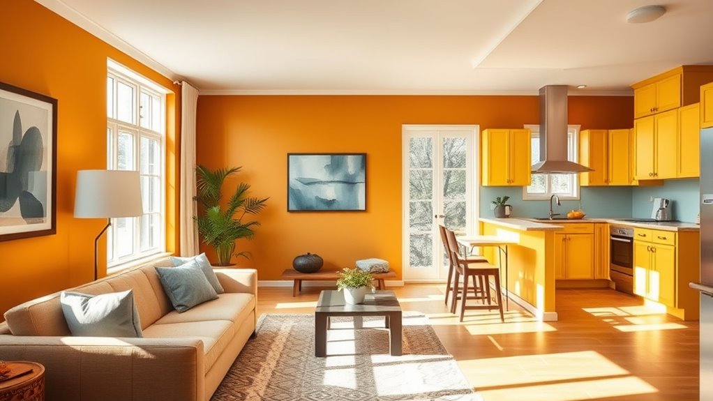
Warm Colors and Their Impact on Mood
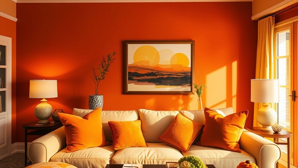
Warm colors like red, orange, and yellow are known for their ability to energize and uplift your mood. These warm hues evoke feelings of excitement, passion, and happiness, creating a sense of emotional warmth in your space. When you incorporate these colors into your room, you may notice increased motivation and a more positive outlook. Warm hues stimulate your senses and foster a lively atmosphere, making them ideal for social areas like living rooms or kitchens. However, too much red or orange can feel overwhelming, so balance is key. Using warm colors thoughtfully can boost your mood and make your environment feel inviting and vibrant. Incorporating color psychology elements with warm tones can enhance the overall ambiance and create a cozy, inviting space. Embracing these shades can also influence emotional response, helping to cultivate a more positive and energetic environment in your home.
Cool Colors and Their Psychological Effects
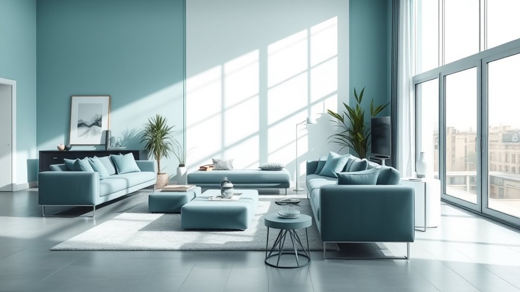
While warm colors energize a space, cool colors like blue, green, and purple promote calmness and relaxation. These hues have a strong psychological impact, often reducing stress and encouraging focus. Understanding color symbolism helps you choose colors that evoke specific emotions, such as tranquility or trust. For example, blue symbolizes stability and peace, while green signifies growth and harmony. Use the table below to see how these colors influence mood:
| Color | Psychological Impact | Common Uses |
|---|---|---|
| Blue | Calmness, trust | Bedrooms, offices |
| Green | Balance, renewal | Living rooms, healing spaces |
| Purple | Creativity, luxury | Meditation rooms, accents |
Choosing cool colors thoughtfully enhances your space’s emotional tone and promotes well-being. Incorporating color psychology principles into your interior design can further optimize the mood you want to create. Additionally, selecting colors based on their psychological effects can help create a harmonious and inviting environment. Recognizing the impact of color on mood can guide you in making more intentional design choices that foster relaxation and positive feelings.
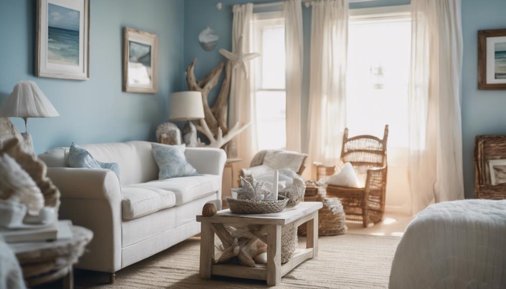
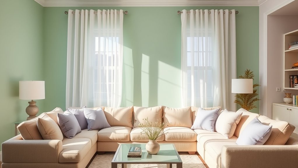
Neutral Tones and Their Role in Space Design
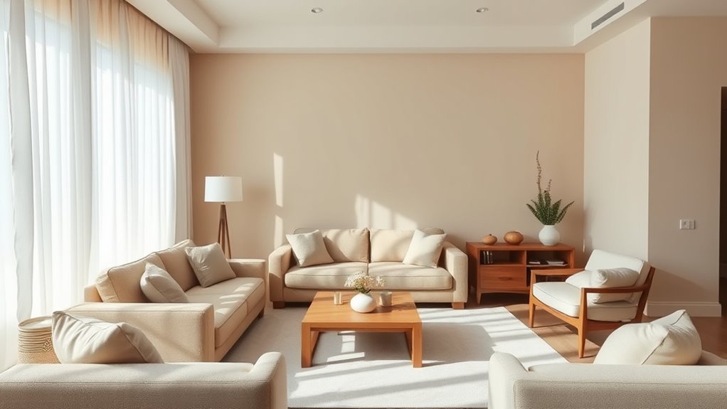
Neutral tones offer remarkable versatility in decor, making it easy to update or change your space without a complete overhaul. They help create calm, soothing atmospheres that promote relaxation and focus. Additionally, these colors can enhance the perception of space, making rooms feel larger and more open. Incorporating diverse planter designs can further elevate your interior aesthetics while maintaining a serene environment. Understanding the differences between aesthetic and offensive security measures can also inform choices that prioritize safety and security in design.
Versatility in Decor
Neutral tones offer a versatile foundation for decorating any space because they easily complement a wide range of colors and styles. They simplify color coordination, allowing you to mix bold hues or soft shades without clashing. Neutral backgrounds also highlight furniture contrast, making individual pieces stand out. To maximize their potential, consider these tips:
- Pair neutral walls with vibrant or patterned accents for lively contrast.
- Use neutral furniture as a base, adding colorful cushions or artwork for pops of color.
- Mix different neutral shades to add depth and subtle variation.
- Balance light and dark neutrals to create visual interest and harmony. Incorporating rustic decor elements can further enhance the cozy and inviting atmosphere of the space.
Creating Calm Atmospheres
Creating a calm atmosphere in a space often starts with the strategic use of neutral tones. These colors promote relaxation and support psychological well-being by reducing visual stimulation. Neutral shades like beige, gray, and soft whites foster tranquility and create a soothing environment. Through color therapy, these tones help lower stress levels and enhance focus. They serve as a versatile backdrop that can be layered with subtle textures and accents for depth without overwhelming the senses. Use the table below to explore ideas for incorporating neutral tones effectively:
| Idea | Example |
|---|---|
| Soothing wall colors | Light gray, warm taupe |
| Soft textiles | Linen curtains, plush rugs |
| Minimal decor | Clean lines, uncluttered spaces |
| Natural materials | Wood, stone accents |
| Balanced lighting | Warm, diffused light |
Additionally, incorporating natural elements like wood accents can enhance tranquility and connect interior spaces with nature. Utilizing neutral tones as a foundation allows for greater flexibility in decorating styles and seasonal updates, making your space adaptable and timeless. Moreover, understanding the impact of color psychology can help you select shades that evoke specific moods and complement your overall design goals.
Enhancing Space Perception
By carefully selecting colors that reflect light and enhance spatial awareness, you can especially influence how a room feels and functions. Neutral tones like beige, gray, and off-white create a sense of openness by reducing visual clutter and promoting a calm atmosphere. These colors leverage psychological associations of tranquility and balance, making spaces feel larger and more inviting. Understanding Free Floating color symbolism helps you choose hues that subtly expand or define areas without overwhelming them. To optimize space perception, consider:
- Using light shades to amplify natural light and create a sense of airiness
- Incorporating matte finishes to minimize reflections and soften the environment
- Combining neutral tones with strategic accent colors for depth
- Choosing consistent hues to unify the space and avoid visual fragmentation
Additionally, understanding spatial perception enhances your ability to select colors that effectively manipulate room dimensions and flow. Incorporating color psychology principles allows you to tailor room hues to evoke desired moods and behaviors, further improving the overall harmony of your space. These tactics help you craft environments that feel spacious, harmonious, and well-balanced.
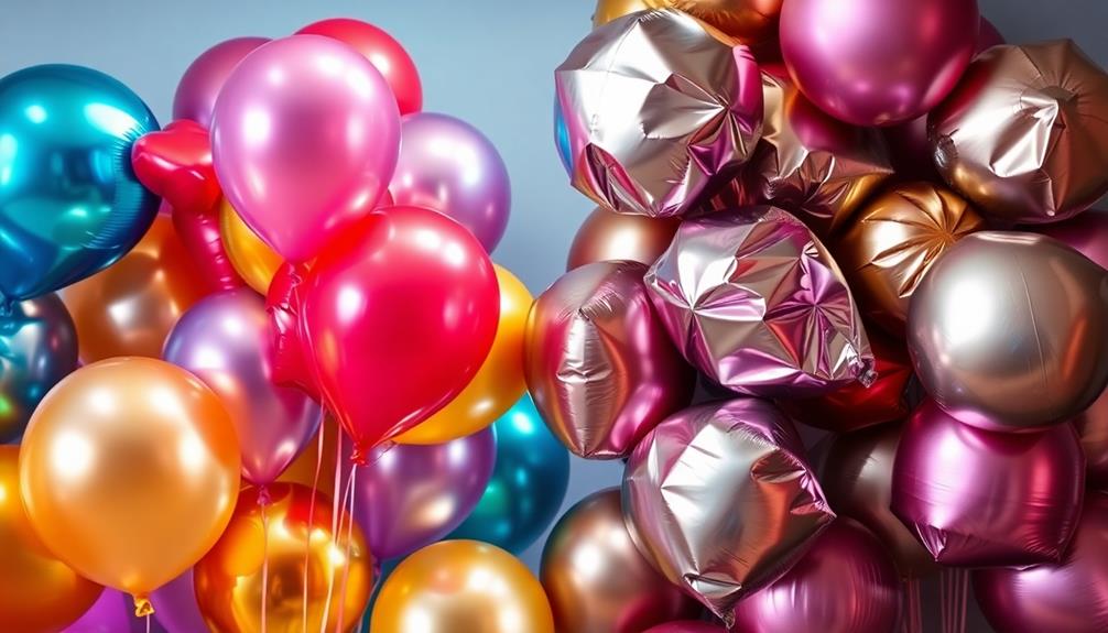
Bright and Vibrant Colors: Energizing or Overwhelming?
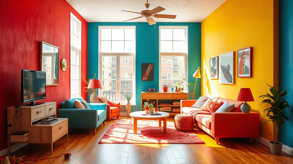
Are bright and vibrant colors always a source of energy, or can they sometimes be too overwhelming? The answer depends on how you use color saturation and achieve visual harmony. High saturation can boost energy, making a space feel lively, but it might also create sensory overload if overdone. To prevent this, balance vibrant hues with neutral tones or softer accents, maintaining visual harmony. Consider the room’s purpose; energetic colors work well in activity areas but may be overwhelming in spaces meant for rest. Your goal should be to evoke excitement without causing overstimulation. When used thoughtfully, bright and vibrant colors can invigorate your space, but be mindful of their intensity to avoid overwhelming your senses. Balance is key to harnessing their energizing potential effectively. Additionally, understanding trailer music techniques can inspire dynamic choices in color schemes to evoke specific moods. Incorporating color psychology principles can further guide you in selecting hues that promote desired emotional responses. Proper color saturation management ensures that your vibrant palette enhances rather than overwhelms your environment.
Using Color to Create Calm and Relaxation
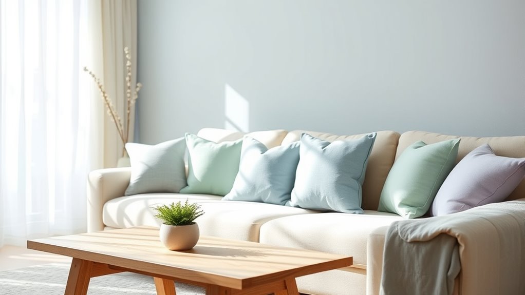
Soft, soothing tones like gentle blues and greens can instantly help you feel more relaxed. Enhancing these colors with natural light makes your space even calmer. You can also consider dog names that evoke tranquility when choosing decor to complement your color scheme. By choosing the right hues and lighting, you create an environment that promotes peace and tranquility. Incorporating attention in creative practice can also help you select the most effective color schemes that foster relaxation, especially when considering cultural considerations in design choices.
Soft, Soothing Tones
Using gentle, muted colors can instantly create a calming atmosphere in any space. Soft, soothing tones are ideal for promoting relaxation and supporting mood regulation through color therapy. These hues help reduce stress and foster a sense of tranquility. To maximize their effect, consider these tips:
- Choose pastel shades like light blue, lavender, or soft green for walls or accents.
- Pair calming colors with natural textures, such as wood or linen, to enhance the soothing effect.
- Use these tones in areas designated for relaxation, like bedrooms or meditation spaces.
- Keep the overall palette simple to avoid overstimulation, allowing the colors to work their calming magic.
Implementing soft, soothing tones supports mood regulation and creates a peaceful environment.
Natural Light Enhancement
Incorporating color thoughtfully can amplify the calming effects of natural light in your space. Lighter, muted hues like soft blues, gentle greens, or warm neutrals reflect natural light better, making your room feel brighter and more inviting. These colors reduce harsh contrasts and prevent overstimulation, creating a sense of calm. Keep color saturation moderate; overly intense colors can absorb light and make a space feel smaller or more enclosed. Instead, opt for low to mid saturation shades that enhance daylight without overpowering it. This balance allows natural light to bounce around freely, boosting relaxation. By choosing the right colors and maintaining proper saturation, you’ll create a serene environment that feels open, airy, and soothing throughout the day.
Cultural Significance of Colors in Interior Design
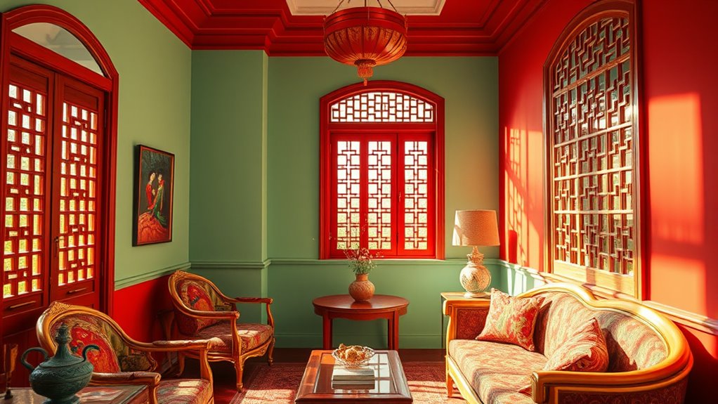
Have you ever wondered how different cultures interpret and value colors in their homes? Cultural symbolism deeply influences interior design choices, shaping regional palettes that reflect history and beliefs. Understanding these nuances helps you create spaces that honor tradition or evoke specific emotions. For example:
- Red often signifies luck and prosperity in Chinese culture.
- White can symbolize purity in Western societies but mourning in some Asian countries.
- Green represents nature and fertility in Middle Eastern regions.
- Gold is associated with wealth and status across many cultures.
Practical Tips for Choosing the Right Colors for Different Spaces
Choosing the right colors for different spaces can profoundly influence how they feel and function. To make effective interior color choices, consider the mood you want each room to evoke. For a calming bedroom, opt for soft blues or greens rooted in color psychology, which promote relaxation. In a lively kitchen or playroom, bright yellows or oranges can energize the space. Think about natural light; darker hues can make a room feel cozy but may also seem smaller, while light colors open up the space. Avoid cluttered palettes by selecting two or three complementary shades for harmony. Ultimately, your color choices should support the room’s purpose and reflect your personal style, creating an environment that’s both functional and inviting.
Combining Colors for Balanced and Harmonious Environments
To create a balanced and harmonious environment, you need to carefully combine colors that complement each other and support the room’s overall design. Using complementary color schemes is a great way to achieve visual balance. You can also apply color contrast techniques to add interest without overwhelming the space. Here are some tips:
- Choose colors opposite each other on the color wheel for striking contrasts.
- Use a neutral shade as a base to tone down bold contrasts.
- Balance vibrant colors with softer hues to prevent overstimulation.
- Test combinations in different lighting to see how colors interact throughout the day.
Frequently Asked Questions
How Do Personal Experiences Influence Color Perception and Emotional Responses?
Your personal experiences shape how you perceive colors and respond emotionally. Personal memories can associate certain hues with specific feelings or events, while cultural associations influence what colors symbolize in your community. These factors make your reactions unique—what feels calming for you might energize someone else. By understanding your background, you can choose colors that support your mood and environment, creating spaces that truly resonate with your emotional needs.
Can Color Choices in Interior Design Improve Mental Health or Well-Being?
Imagine it’s the 21st century, and you’re discovering how color therapy can boost your emotional well-being. Bright, calming hues like blues and greens can reduce stress, while warm tones like yellows energize and uplift you. By carefully choosing your room colors, you actively support your mental health. Yes, your interior design choices can create a soothing environment, helping you feel more balanced and positive every day.
How Does Lighting Affect the Psychological Impact of Room Colors?
Lighting plays a vital role in how room colors influence your mood. Natural light enhances true color tones, making warm colors feel cozy and cool tones calming. Artificial lighting, depending on its warmth or coolness, can alter these effects, either intensifying or muting the intended psychological impact. You can optimize your space by balancing natural light and choosing appropriate artificial lighting to support the desired atmosphere and well-being.
Are There Specific Colors Recommended for Enhancing Productivity in Workspaces?
When it comes to boosting productivity in your workspace, choosing the right colors is key. You want to hit the nail on the head with effective color combinations and understand their color symbolism. Blues and greens promote focus and calmness, while subtle yellows energize without overwhelming. These hues help create an environment where you can work efficiently, turning your space into a powerhouse of productivity.
How Do Age and Gender Influence Color Preferences and Emotional Reactions?
You should consider that age and gender influence color preferences and emotional reactions because cultural color associations and color symbolism in traditions shape individual responses. Younger people might favor vibrant hues, while older adults prefer calmer shades. Gender differences also play a role, with certain colors linked to masculinity or femininity. Understanding these factors helps you choose room colors that resonate emotionally, creating a more comfortable and personalized space.
Conclusion
By understanding how colors influence mood and perception, you can transform any space into a reflection of your personality and needs. Whether you prefer warm tones to energize or cool shades to relax, choosing the right palette makes all the difference. Remember, it’s not just about aesthetics—colors can truly set the tone for your environment. So, don’t be afraid to experiment and find what works best, because at the end of the day, it’s your space to enjoy.