
To choose prints that complement your skin tone and hair color, start by identifying whether you have cool, warm, or neutral undertones. If you’re a winter or summer, opt for softer, less contrasting patterns like watercolors or muted florals. For autumn or spring, bold, vibrant prints with earthy or lively hues work well. Balancing contrast and harmony helps you highlight your natural features effortlessly—keep exploring to discover how to perfect your look with the right print choices.
Key Takeaways
- Match patterns to your seasonal color analysis to enhance natural skin undertones and hair color.
- Opt for high-contrast prints like geometric shapes if you have winter-season coloring.
- Choose softer, muted patterns for summer types with cool undertones and blended features.
- Use earthy, organic prints to complement autumn tones and warm skin/hair combinations.
- Select vibrant, lively patterns such as stripes or florals to suit spring’s bright and clear coloring.
When selecting prints that complement your skin tone and hair color, understanding which patterns enhance your natural features is essential. It’s not just about picking pretty designs; it’s about creating a balanced look that highlights your best qualities. To do this effectively, you need to contemplate the concepts of contrast and harmony within your overall appearance. Contrast helps you determine whether bold, striking patterns will make your features stand out or if softer, more blended prints will create a cohesive look. Harmony, on the other hand, involves choosing prints that work seamlessly with your skin’s undertone and hair hue, ensuring everything feels unified rather than chaotic.
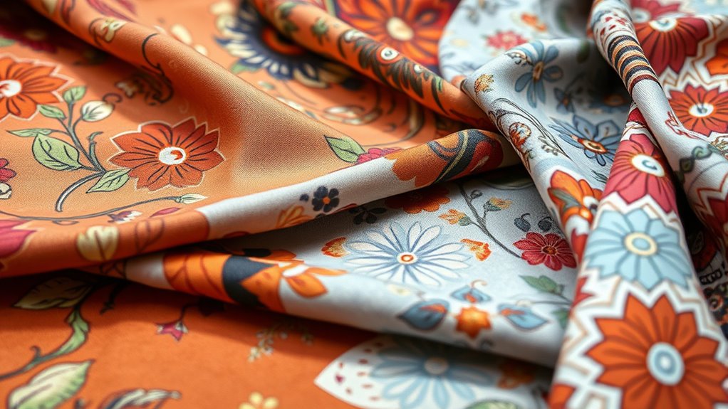
One useful method to guide your choices is seasonal color analysis. This approach categorizes skin tone, hair color, and eye color into four main seasons—spring, summer, autumn, and winter—each with characteristic color palettes. For example, if you fall into the winter category, you typically have cool undertones and can handle high-contrast patterns like black and white or jewel tones. Your ideal prints might include geometric shapes or bold florals that emphasize contrast without overwhelming your natural coloring. Conversely, if you’re a summer type with softer, cooler undertones, you’ll want prints with muted, pastel shades that promote harmony. Gentle floral or watercolor patterns can enhance your delicate features while maintaining a calm, cohesive look.
Understanding your seasonal color analysis helps you choose prints that naturally flatter you. For instance, autumn types with warm undertones often look stunning in earthy tones and organic patterns like leaves or abstract shapes inspired by nature. These prints create a sense of harmony by echoing your warm palette and blending seamlessly with your skin and hair. Meanwhile, spring types, characterized by bright, warm, and clear coloring, benefit from lively patterns with vibrant colors—think playful stripes or cheerful floral prints—that complement their lively energy. Supporting this approach, studies on optimal angles for pinball machines emphasize how aligning elements with natural features enhances overall performance and appeal, much like choosing the right prints enhances your appearance.
When you focus on contrast and harmony, you make smarter choices. High-contrast prints work well if your natural features can handle it—like a deep hair color paired with a light skin tone—while softer, low-contrast patterns suit those with more blended coloring. Seasonal color analysis simplifies this process by providing a framework that aligns your print choices with your innate coloring, ensuring you look vibrant and balanced. Remember, the goal isn’t just to wear pretty patterns but to select prints that respect your natural contrast levels and enhance your overall harmony. When you master this, dressing becomes an effortless way to showcase your unique beauty.
Frequently Asked Questions
How Do Seasonal Color Analysis Methods Influence Print Choices?
Seasonal color analysis guides you to select prints that match your seasonal palette, enhancing your natural color harmony. By understanding whether you’re a winter, summer, spring, or fall, you can choose prints with colors that complement your skin tone and hair color. This method helps you avoid clashing, making your overall look more cohesive and vibrant. Ultimately, seasonal analysis simplifies print choices, ensuring you feel confident and stylish in every outfit you wear.
Are There Prints That Complement Both Warm and Cool Undertones?
You can embrace versatile styles with universal prints and adaptable patterns that flatter both warm and cool undertones. These prints act like chameleons, effortlessly complementing a range of complexions and hair colors. Look for designs featuring balanced color palettes, such as neutrals with pops of color or subtle patterns that don’t lean heavily toward one undertone. This way, your wardrobe remains harmonious, no matter your skin tone or hair hue.
Can Print Preferences Change With Age or Skin Aging?
Yes, your print preferences can change with age or skin aging impacts. As you experience age-related changes, your skin tone and texture may shift, influencing what looks best on you. You might find that softer, muted prints become more flattering, or you prefer prints that add vibrancy to your look. Adjusting your choices ensures you stay confident and comfortable, embracing your evolving style with age.
How Do Personal Style and Personality Affect Print Selection?
Your personal style and personality greatly influence your print choices. If you’re playful and bold, you might prefer vibrant, eye-catching patterns that express your lively nature. For a more sophisticated or understated vibe, subtle or classic prints work best. By aligning prints with your personality expression, you create a cohesive look that feels authentic and makes you feel confident in your style.
Are There Specific Prints to Avoid for Sensitive Skin?
Avoid prints with rough fabric textures and overly busy print scales, as they can irritate sensitive skin. Instead, opt for smooth fabrics like cotton or silk, and choose prints with gentle, moderate scales that won’t overwhelm your skin. Prioritize soft textures and balanced patterns to prevent discomfort and irritation. By focusing on fabric textures and print scale, you create a comfortable, stylish look without risking skin sensitivity.
Conclusion
Don’t let doubts hold you back from trying different prints. Remember, fashion is about expressing yourself and feeling confident in what you wear. Even if a print initially seems too bold, give it a chance—you might find it highlights your best features and boosts your mood. So, experiment with different patterns and trust your instincts. After all, the perfect print is the one that makes you feel fabulous every time you wear it.