
To master pattern play, start by choosing a dominant print as your focal point and build around it with smaller, supporting patterns. Use colors strategically, combining similar shades or contrasting hues for visual interest. Mix different scales of prints, like pairing large florals with small stripes, and incorporate textures for depth. Keep a balanced approach by limiting prints to two or three items and using neutrals to tie the look together. Want to become a pattern pro? Keep exploring the essentials.
Key Takeaways
- Mix different print sizes, pairing large prints with smaller ones for visual interest and balance.
- Use a cohesive color palette, repeating hues across patterns to create unity and harmony.
- Combine textures like silk with burlap or velvet for added depth and tactile variety.
- Start with neutral or similar shades to ease into pattern mixing, gradually introducing bolder contrasts.
- Maintain visual balance by anchoring outfits with dominant prints and supporting smaller, complementary patterns.
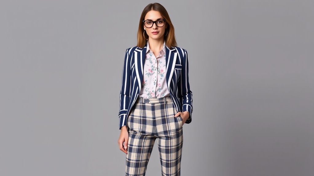
Understanding the Basics of Pattern Mixing
Have you ever wondered how to pair different patterns without overwhelming your look? The key is understanding fabric textures and seasonal patterns. Mixing textures like lace, denim, or silk adds depth, making combinations more visually interesting. Seasonal patterns, such as florals in spring or plaids in fall, help create harmony by aligning with the time of year. When combining prints, start with small-scale patterns and gradually introduce larger ones to avoid chaos. Keep the color palette cohesive, sticking to complementary or matching tones. Balance is essential: if you wear a bold patterned top, pair it with a more subdued bottom. Additionally, incorporating pattern contrast techniques like collaborative problem-solving can inspire creative styling ideas. Understanding outdoor environments and their influence on fabric choices can also enhance your styling decisions. With a little experimentation, you’ll learn how textures and seasonal patterns can work together to create a stylish, well-balanced look.
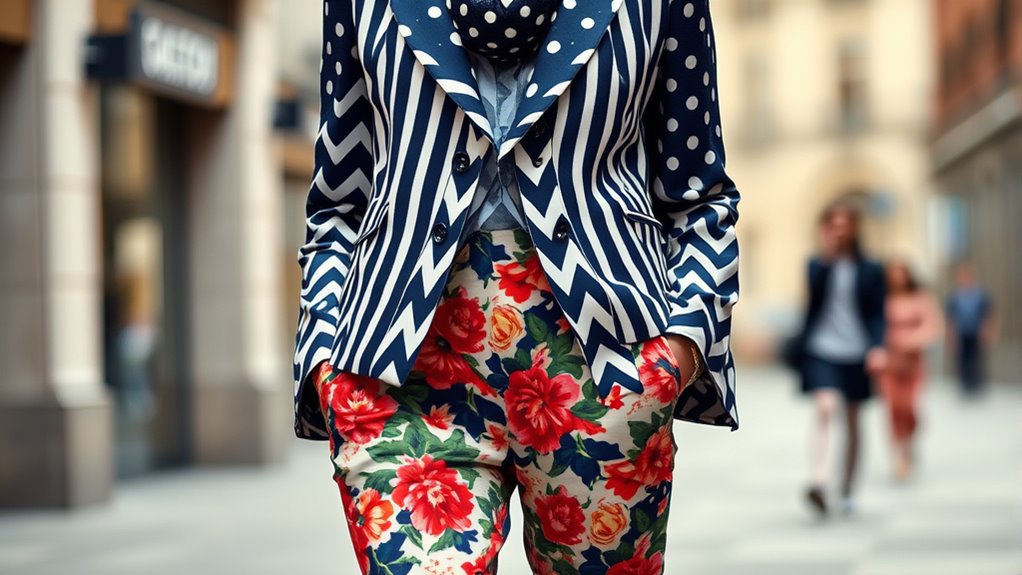
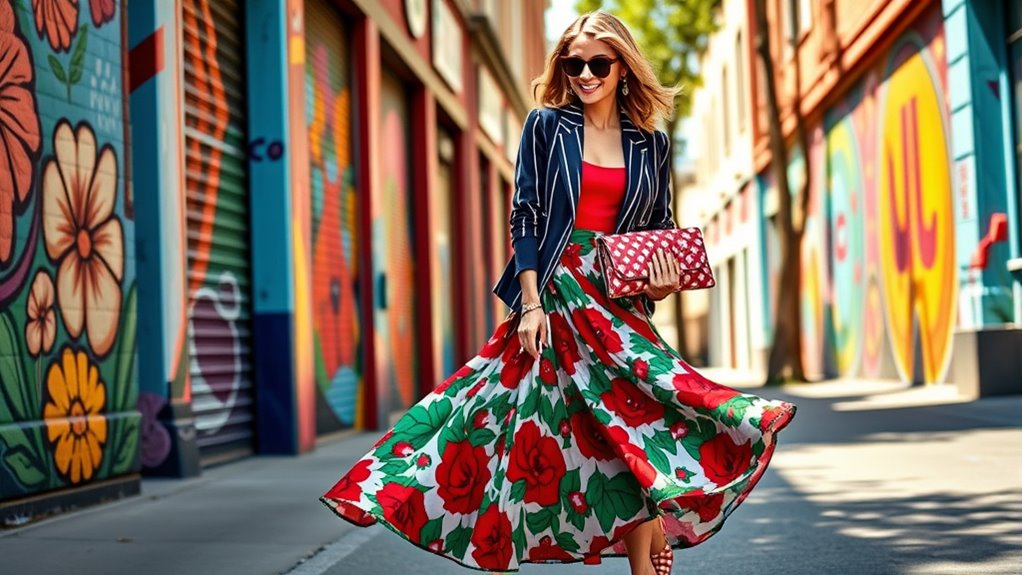
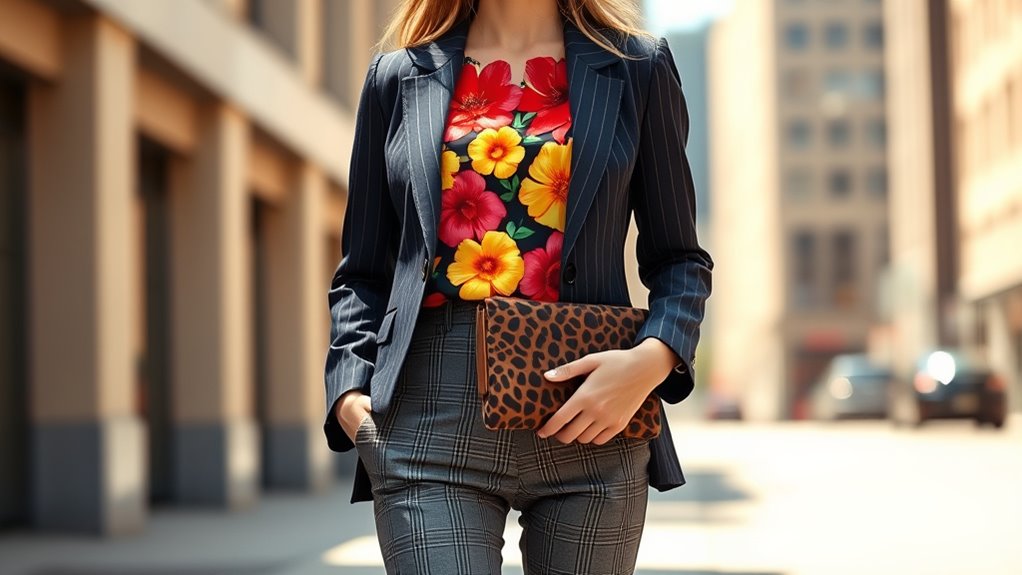
Choosing a Dominant Print as Your Focal Point
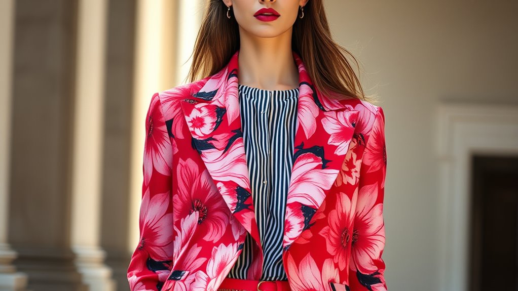
Ever wonder how to make a patterned outfit look intentional and polished? It starts with choosing a dominant print as your focal point. Think about fabric types—silk, cotton, or linen—when selecting your print, as they influence the overall vibe. For example, a bold floral silk blouse can serve as the statement piece, while a more subtle, textured fabric like a woven cotton keeps the look balanced. Consider seasonal trends too; in spring, opt for fresh florals or pastel patterns, while in fall, earthy tones and larger prints work well. This dominant print anchors your outfit, making it easier to incorporate complementary patterns without overwhelming. Additionally, understanding design harmony can help you create a balanced and fashionable outfit by mixing prints thoughtfully. Using color coordination strategies can further unify your look and ensure that different patterns work together seamlessly. By thoughtfully selecting your key print, you create a cohesive, stylish look that feels intentional and confident.
Playing With Color Coordination and Contrast
You can make your patterns stand out by balancing bold hues with more subdued tones. Creating visual contrast helps each element pop without overwhelming the eye. By carefully coordinating colors, you’ll achieve a striking, harmonious look that grabs attention. Practicing your color coordination techniques can help you maintain a smooth ride as your outfit transitions between different styles and prints.
Balancing Bold Hues
Balancing bold hues involves carefully managing how vibrant colors interact to create a cohesive look. One effective technique is color blocking, where you combine large blocks of contrasting shades to make a statement without overwhelming. To maintain harmony, repeat patterns in similar hues across your outfit, creating a sense of unity through pattern repetition. When mixing bold colors, keep the rest of your ensemble simple to avoid clashing. Use neutral accessories or subtle textures to anchor your look. Focus on pairing colors that complement each other—like royal blue with bright yellow or coral with turquoise—to achieve a balanced, eye-catching effect. Remember, the goal is to make your hues pop without competing, ensuring your overall style remains sophisticated and polished. Additionally, understanding how color coordination can influence the overall harmony of your look is essential for achieving a polished appearance. Incorporating visual balance techniques can further enhance your ability to mix and match prints seamlessly. Taking time to assess your color palette helps in creating harmonious combinations that are visually appealing.
Creating Visual Contrast
Creating visual contrast is a powerful way to make your outfit stand out, especially when working with bold hues. Understanding pattern psychology helps you choose prints that evoke specific moods or energy, making your ensemble more impactful. Playing with contrast involves pairing colors and prints thoughtfully—think complementary or monochromatic schemes that create a striking balance. The print history offers insights into traditional combinations and innovative pairings, guiding your choices to achieve harmony or deliberate tension. When you combine patterns with contrasting colors, you draw attention and add depth to your look. Keep in mind that high contrast can be bold, but balancing it with neutral tones prevents overwhelm. Additionally, being aware of divorce statistics can help individuals better understand and navigate emotional transitions during such times. Incorporating unexpected pattern pairings can also introduce an element of surprise and individuality to your style. Moreover, understanding the importance of diversification strategies in investment can inspire you to approach your wardrobe with a more strategic and creative mindset, blending different patterns for a unique aesthetic. Ultimately, mastering contrast elevates your pattern play, making your style both dynamic and visually compelling.
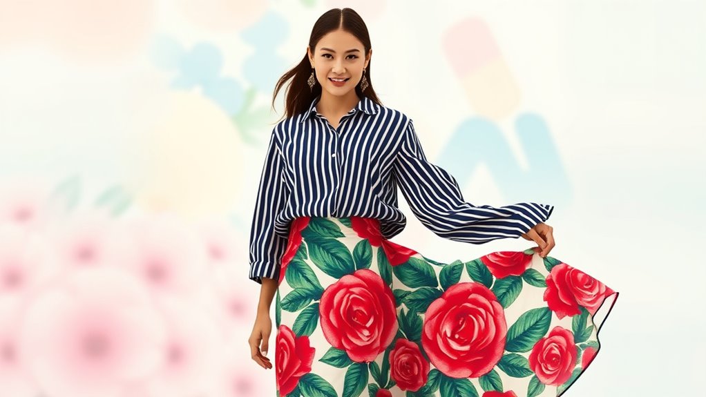
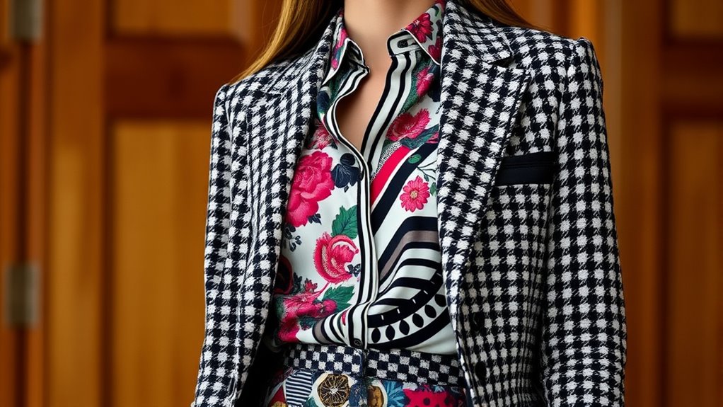
Mixing Scale and Size of Prints Effectively
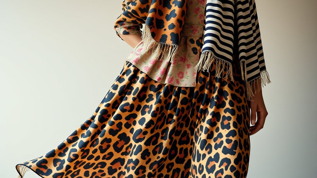
Mixing large and small prints creates visual interest and balance in your outfit. Varying print proportions helps emphasize your best features and keeps the look fresh. Using scale thoughtfully allows you to highlight specific areas and create a cohesive, stylish appearance. Additionally, understanding different personality traits can enhance your confidence in experimenting with bold patterns and styles. Recognizing the versatility of prints can also guide you in combining patterns that complement your overall look. Being aware of zodiac sign compatibility can inspire you to select patterns and styles that resonate with your personal energy and relationship dynamics.
Balance Large and Small Prints
Have you ever wondered how to make a pattern combination look harmonious rather than chaotic? The key is balancing large and small prints, which influences pattern harmony. Large prints draw attention and create focal points, while small prints add subtlety and contrast. To achieve a balanced look, pair a big print with smaller, complementary patterns. This technique ensures your ensemble remains visually appealing and avoids being overwhelming. Consider this chart for guidance:
| Large Print | Small Print |
|---|---|
| Dominates the look | Supports without overpowering |
| Anchor piece | Accent or detail |
| Eye-catching | Subtle background |
| Bold patterns | Delicate details |
| Statement piece | Balance and harmony |
Using the right print scale guarantees your outfit feels intentional and cohesive. Additionally, understanding visual balance can help you craft more appealing and stylish combinations. Recognizing the importance of pattern scale ensures your styling choices are both intentional and effective.
Vary Print Proportions
Balancing large and small prints is a great start, but adding variety in print proportions takes your outfits to the next level. To do this effectively, focus on print scale and print size. Mixing different print sizes creates visual interest and prevents your look from feeling monotonous. Combine a bold, large-scale print with a subtle, small-scale pattern to add contrast. When pairing prints, consider the impact of print size on the overall balance—larger prints draw attention, while smaller prints offer a quieter backdrop. Varying print proportions also helps define your silhouette, making your outfit look more intentional and polished. Remember, mixing print sizes isn’t just about contrast; it’s about creating harmony and visual flow that keeps your look fresh and engaging. Incorporating visual balance principles ensures your print combinations appear cohesive and well-thought-out. Furthermore, understanding the importance of proportion can enhance your styling skills and elevate your overall look. To master this, paying attention to the scale of prints can make your outfits look more deliberate and stylish.
Use Scale to Highlight Features
Ever wonder how to draw attention to your best features using prints? Using scale contrast is your secret weapon. Large, bold prints can emphasize your favorite areas, like your waist or shoulders, making them stand out effortlessly. Conversely, smaller prints create a subtle print harmony that balances proportions and keeps the focus where you want it. Mixing different print sizes intentionally guides the eye, highlighting features without overwhelming your look. When you pair a large print with a smaller one thoughtfully, you achieve a cohesive and balanced outfit. Remember, the goal is to use scale to your advantage, creating visual interest while maintaining harmony. This approach ensures your prints work together to highlight your best features with confidence and style.
Incorporating Neutral Tones to Balance Bold Patterns
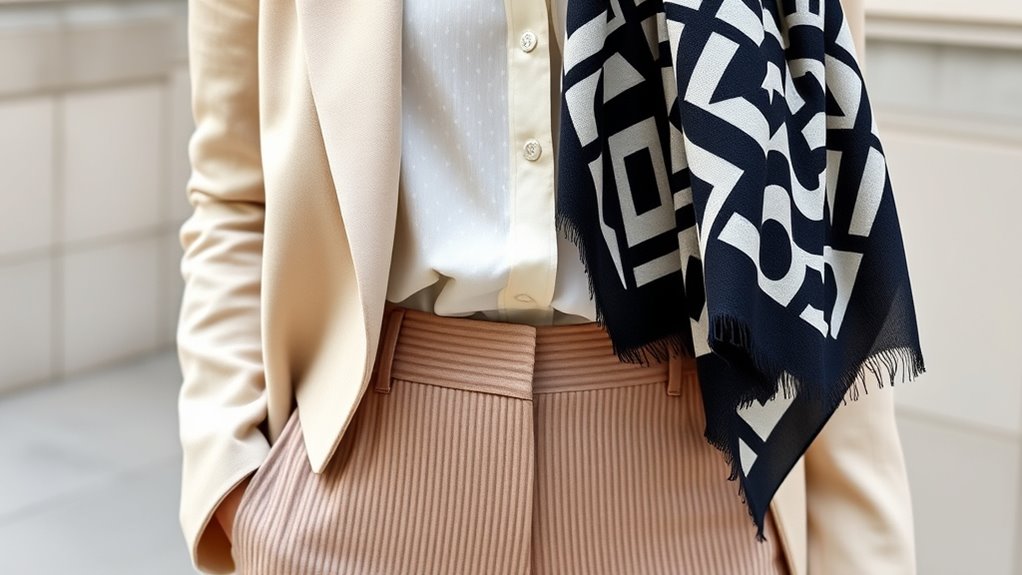
When incorporating bold patterns into your design, neutral tones serve as essential balancing elements that prevent the space from feeling overwhelming. Using neutral shades like beige, gray, or ivory creates a calm backdrop that allows your patterns to stand out without clashing. To enhance this balance, focus on texture contrast; pairing smooth fabrics with textured ones adds depth without competing with the prints. Neutral tones also simplify fabric pairing, making it easier to combine different materials seamlessly. These hues anchor your design, making bold patterns appear intentional rather than chaotic. Incorporating visual balance in your design helps achieve a harmonious look that highlights your patterns while maintaining visual balance and sophistication.
Pairing Prints by Theme or Style for Cohesion
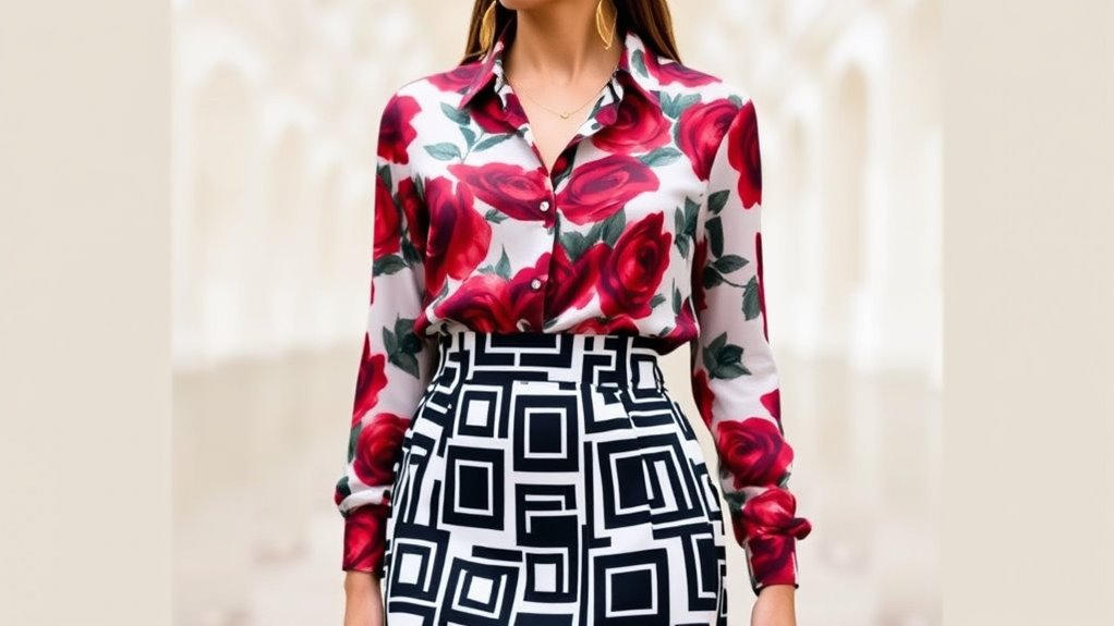
Pairing prints by theme or style creates a cohesive and intentional look in your space. When you focus on pattern themes, your print pairing feels deliberate and sophisticated. Choose patterns with similar motifs, color palettes, or eras to guarantee harmony. For example, pairing floral prints with botanical motifs or geometric patterns with modern lines enhances visual flow. Use the table below to identify compatible pattern themes:
| Pattern Theme | Style Characteristics | Recommended Pairings |
|---|---|---|
| Botanical | Nature-inspired, organic shapes | Florals with leafy prints |
| Geometric | Clean lines, symmetry | Chevron with stripes |
| Abstract | Artistic, freeform designs | Painterly prints with bold shapes |
| Vintage | Retro motifs, nostalgic vibe | Polka dots with damask patterns |
This strategy guarantees your prints complement each other seamlessly.
Using Accessories to Tie Different Prints Together
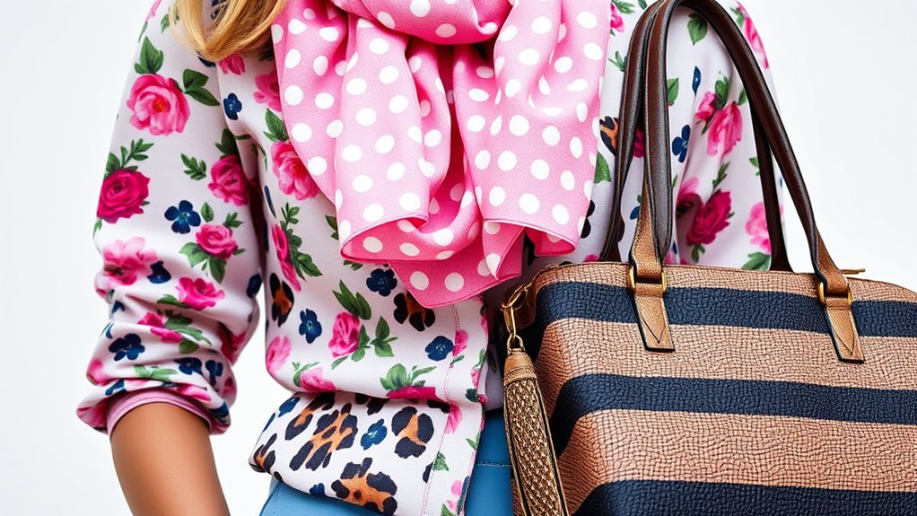
Accessories are powerful tools for connecting different prints and creating a unified look in your space. By carefully choosing accessory color coordination, you can seamlessly tie various patterns together. For example, select print matching accessories like throw pillows, vases, or artwork that feature hues from your prints. This subtle link provides visual harmony without overwhelming the space. Mixing printed accessories with solid-colored items also works well, as long as the colors complement your overall palette. Focus on repeating key colors or motifs across your accessories to create cohesion. Remember, the goal is to guide the eye and unify diverse patterns, so avoid cluttering with too many prints. Thoughtful accessory color coordination transforms a mismatched mix into a stylish, cohesive display.
Exploring Different Textures to Add Depth
Adding different textures to your space instantly creates visual interest and a sense of layered complexity. To achieve this, incorporate textured fabrics and layered materials that contrast and complement your prints. Here are four ideas:
- Mix smooth and rough fabrics, like silk with burlap, for tactile variety.
- Use textured fabrics such as velvet or tweed to add richness.
- Layer materials like a woven throw over a printed sofa for dimension.
- Incorporate natural elements like jute rugs or wicker accents to enhance texture.
Tips for Transitioning From Subtle to Bold Pattern Combinations
Start by choosing neutral tones to create a calm base for your patterns. As you gain confidence, gradually introduce more contrast to make bold patterns stand out. This step-by-step approach helps you shift smoothly without feeling overwhelmed.
Start With Neutral Tones
Neutral tones create a calm foundation, making it easier to experiment with bolder patterns later on. They help you ease into the world of pattern mixing without feeling overwhelmed. Start with monochrome minimalism, choosing shades like black, white, or beige to keep your look simple yet sophisticated. Incorporate geometric symmetry, such as stripes or checks, to add visual interest without clashing. Here are some tips to get started:
- Begin with a neutral base, like a beige top or black pants.
- Add a patterned accessory, such as a striped scarf or checked shoes.
- Mix subtle prints with similar tones for a cohesive look.
- Use neutral-toned patterns to gradually introduce bold prints comfortably.
Starting with neutral tones builds confidence and sets the stage for bolder, more complex pattern combinations.
Gradually Increase Contrast
To successfully shift from subtle to bold pattern combinations, you should gradually increase contrast in your outfits. Contrast layering helps you build confidence, blending prints with varying degrees of brightness and intensity. Start by pairing prints with similar tones for print harmony, then slowly introduce more contrasting colors. This progression prevents overwhelming your look and makes bold patterns feel natural.
Here’s a simple guide:
| Step | Pattern Pairing | Contrast Level |
|---|---|---|
| 1 | Subtle prints in similar shades | Low contrast |
| 2 | Prints with differing patterns but muted tones | Moderate contrast |
| 3 | Bright, contrasting prints | High contrast |
| 4 | Mixing large and small patterns | Increasing contrast |
| 5 | Bold, clashing prints | Max contrast |
Gradually increasing contrast enhances print harmony and creates a cohesive, eye-catching style.
Common Mistakes to Avoid When Mixing Prints
Mixing prints can create a bold and stylish look, but it’s easy to make mistakes that turn your outfit into a visual jumble. To avoid this, watch out for common pitfalls.
Mixing prints is bold and stylish—just watch out for common mistakes that turn your outfit into visual chaos.
- Print clashing: Don’t pick prints with conflicting patterns or scale; aim for harmony instead of chaos.
- Color mismatch: Avoid mixing prints with clashing or overly contrasting colors; stick to a cohesive color palette.
- Ignoring scale: Pairing small and large prints without balance can overwhelm your look—adjust the size for harmony.
- Overdoing it: Too many prints at once can overwhelm; limit yourself to two or three to keep it chic.
Frequently Asked Questions
How Can I Adapt Pattern Mixing for Professional Settings?
When adapting pattern mixing for professional settings, you should focus on subtlety. Use accessorizing techniques to add interest without overwhelming your look, and choose fabrics that coordinate well in color and texture. Stick to a neutral palette with one or two patterned pieces, like a printed blouse paired with a solid blazer. Keep your overall look polished and balanced, ensuring your pattern choices remain sophisticated and appropriate for the workplace.
What Are Some Quick Tips for Beginners Trying Pattern Pairing?
They say, “Practice makes perfect,” and that’s true for pattern pairing. As a beginner, start with two prints in the same color family to simplify. Focus on color coordination and fabric contrast to create harmony. Keep one print bold and the other subtle, and don’t be afraid to try different textures. With confidence, you’ll master mixing prints effortlessly and elevate your style instantly.
Can Pattern Mixing Be Suitable for All Body Shapes?
Pattern mixing can absolutely suit all body shapes when you focus on body positivity and follow stylist advice. You should choose prints that highlight your favorite features and make you feel confident. Play with scale and contrast to create balanced looks, regardless of your shape. Remember, the key is to wear what makes you feel comfortable and empowered, embracing your unique style with confidence.
How Do Seasonal Trends Influence Pattern Pairing Choices?
Imagine your wardrobe as a garden, blooming with seasonal trends guiding your pattern pairing choices. Seasonal trends influence your style like weather shaping a landscape, encouraging fresh combinations. As spring brings pastels and florals, your pattern pairing influence shifts, inspiring playful, light mixes. In winter, deeper hues and cozy textures dominate, prompting more subtle matches. Staying current helps your outfits feel vibrant, aligned with the season’s spirit and your personal expression.
Are There Specific Patterns That Should Be Avoided Together?
You should avoid pairing patterns that create a clash or conflicting prints, like large florals with busy animal prints. These combinations can overwhelm your look and make the patterns compete instead of complement. Stick to patterns with similar scales or color palettes to prevent a conflicting print. When in doubt, choose one statement print and balance it with more subtle, solid pieces to keep your outfit stylish and cohesive.
Conclusion
Now that you’ve revealed the secrets of pattern play, step into your wardrobe like an artist wielding a vibrant palette. Embrace the dance of colors, scales, and textures, turning each outfit into a masterpiece that reflects your bold spirit. With confidence as your brushstroke, you’ll create looks that sing with personality and flair. So go ahead—mix, match, and let your style story unfold like a captivating tapestry woven with your unique touch.