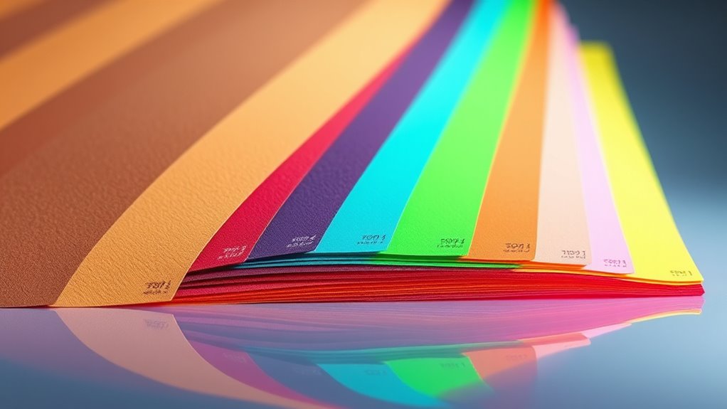
The 2025 color craze blends earthy neutrals like Pantone’s Mocha Mousse with vibrant neon greens, creating bold contrasts that energize fashion and interiors. You’ll see soft pastels, metallic sheens, and nature-inspired hues that evoke calm and environmental connection, alongside striking color blocking ideas. Sustainable practices and innovative finishes are key trends. To master this dynamic palette and discover how to implement these ideas stylishly, keep exploring the latest tips and insights.
Key Takeaways
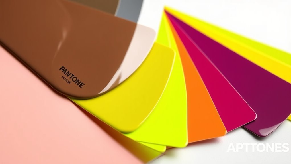
- Pantone’s Mocha Mousse is a key neutral color trend in 2025, emphasizing comfort, stability, and sophisticated warmth.
- Neon Green dominates vibrant color trends, symbolizing vitality, environmental awareness, and youthful energy across fashion and design.
- Metallic finishes and bold contrast techniques enhance the visual impact of trending colors, creating futuristic, eye-catching effects.
- Pastel palettes are evolving with dynamic, textured neutrals and optimistic hues, balancing tradition and innovation in 2025 trends.
- Sustainability influences color choices, encouraging eco-friendly materials and applications that support environmentally responsible design practices.
The Rise of Earthy Tones: Embracing Pantone’s Mocha Mousse
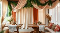
As interior design continues to evolve, earthy tones are gaining popularity for their warm, grounding effect. You’ll notice how Pantone’s Mocha Mousse fits perfectly into this trend, offering a sophisticated shade rooted in color psychology. Historically, earthy colors have been used for their calming and stabilizing qualities, dating back to ancient times when natural pigments were prized. Today, their appeal lies in their versatility and ability to evoke comfort and stability in any space. By choosing Mocha Mousse, you’re tapping into a rich tradition of colors associated with nature and tranquility. This hue’s deep, warm tones create an inviting atmosphere, making your home feel more grounded and balanced. Incorporating rustic decor elements further enhances this sense of authenticity and coziness. The resurgence of natural palettes is also supported by AI-driven design tools that analyze color trends and suggest harmonious schemes. Recognizing the benefits of earthy tones, many designers now recommend them for creating spaces that promote relaxation and well-being. It’s no wonder earthy tones are becoming a staple in contemporary design.
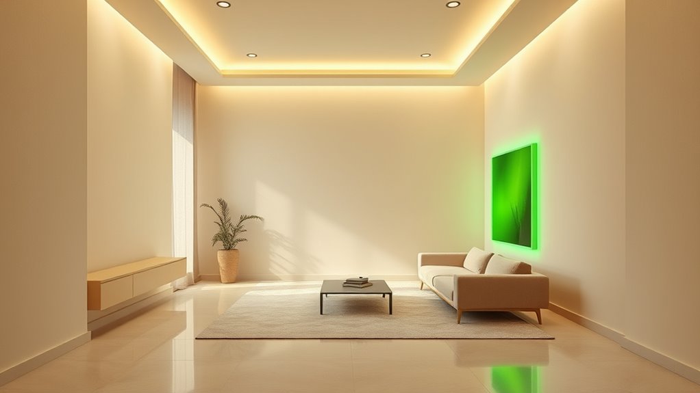
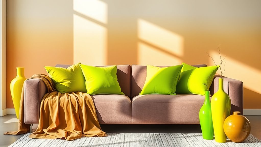
Vibrant Accents: The Allure of Neon Green
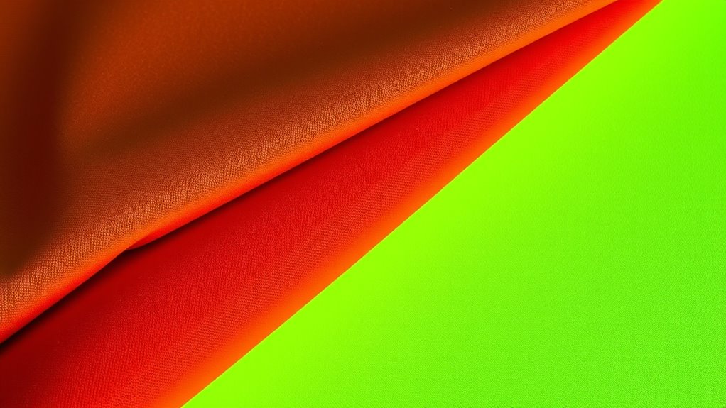
Neon green instantly grabs attention and creates a striking visual impact. You’ll see it making bold fashion statements and standing out in high-energy environments. Its vibrant glow energizes spaces and outfits alike, making it impossible to ignore. When applied with proper spray techniques, the finish remains smooth and consistent, enhancing its eye-catching appeal. Additionally, understanding color accuracy can help ensure the most vivid and true-to-life appearance in various lighting conditions. Proper interior lighting can also play a crucial role in how the neon green appears and impacts a space.
Eye-Catching Visual Impact
Have you ever noticed how a splash of vibrant green can instantly draw your eye? Neon green’s boldness creates a striking visual impact, especially when paired with monochrome minimalism or monochromatic palettes. In these sleek, simplified designs, the vibrant hue acts as a focal point, breaking the monotony and energizing the space or look. Whether in graphic design, interior decor, or fashion, neon green grabs attention without overwhelming. It’s about using color strategically to make your message pop. By balancing subtle shades with this electrifying accent, you achieve a dynamic, eye-catching effect. This approach guarantees your visuals are memorable, engaging, and effortlessly modern, making neon green a must-have for those aiming for maximum impact with minimum clutter. Decoding slang can help you understand how such bold color choices can be perceived as trendy or attention-grabbing in modern visual language. Incorporating visual impact techniques like these can elevate your overall design strategy. Additionally, understanding color theory enhances your ability to craft balanced and compelling color combinations.
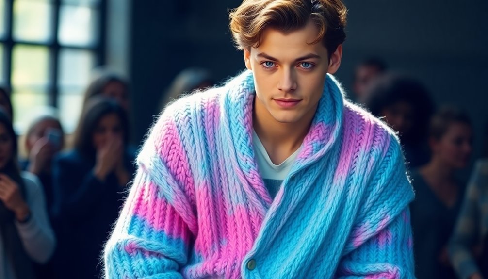
Trendsetting Fashion Statements
Vibrant accents like neon green are revolutionizing fashion by turning simple outfits into bold statements. This eye-catching shade grabs attention instantly and embodies confidence. You’ll find it paired effortlessly with sustainable fabrics like organic cotton or recycled nylon, making eco-conscious choices stand out. Neon green also taps into color psychology, symbolizing energy, freshness, and innovation—perfect for setting trends. Wearing this color signals a fearless attitude and a desire to challenge norms. As designers embrace sustainability, neon green becomes more than just a statement; it reflects a commitment to environmental responsibility. Sustainable fashion is increasingly incorporating vibrant hues like neon green to promote both style and eco-awareness. Additionally, the use of eco-friendly materials enhances the overall appeal by aligning fashion with environmental values. Incorporating eco-conscious production methods further emphasizes the importance of sustainability in trendsetting fashion. Whether in accessories, activewear, or statement pieces, neon green’s allure lies in its ability to combine boldness with purpose, inspiring you to make fashion-forward, impactful choices.
High-Energy Environments
In high-energy environments like concerts, festivals, and bustling urban spaces, neon green naturally commands attention and amplifies the atmosphere. Its vibrant hue stimulates excitement and urgency, making it perfect for capturing focus. From a color psychology perspective, neon green symbolizes vitality and innovation, energizing crowds. Culturally, it often represents growth, renewal, and environmental awareness, resonating with youthful optimism. To deepen this understanding, consider the following:
| Color Psychology | Cultural Symbolism |
|---|---|
| Stimulates energy and alertness | Signifies renewal and sustainability |
| Promotes creativity | Represents vitality and youth |
| Evokes excitement | Symbolizes growth and progress |
| Enhances visibility | Embodies modern innovation |
Neon green’s powerful dual role heightens its appeal in vibrant spaces, making it an essential accent for high-energy settings. Additionally, recent advances in AI-powered design tools are enabling creators to experiment with more dynamic and personalized color schemes, further elevating the impact of neon hues in visual environments. Moreover, understanding the cultural significance of colors can enhance their effective use in branding and event design, allowing for more meaningful engagement with audiences. Incorporating positive thinking principles can also inspire designers to approach color schemes with optimism and creativity, fostering innovative outcomes.
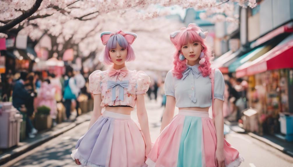
Pastel Palettes Reinvented for 2025
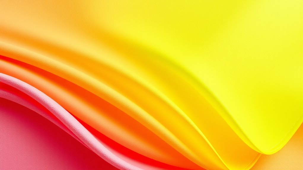
How are pastel palettes transforming in 2025? They’re becoming more dynamic, blending tradition with innovation. Designers are reimagining pastels through the lens of color psychology, emphasizing calming, optimistic vibes, and emotional resonance. Cultural symbolism also plays a key role, with soft hues representing renewal, innocence, and harmony across diverse communities. Additionally, the use of color formulations allows for more nuanced and expressive pastel shades that enhance their versatility and emotional impact. The evolving color trends reflect a broader cultural shift toward personalization and emotional connectivity in design. Recognizing the influence of angel numbers can inspire designers to incorporate meaningful symbolism and emotional depth into their color choices, resonating more deeply with audiences.
Metallics and Sheens: Adding Shine to the Color Spectrum
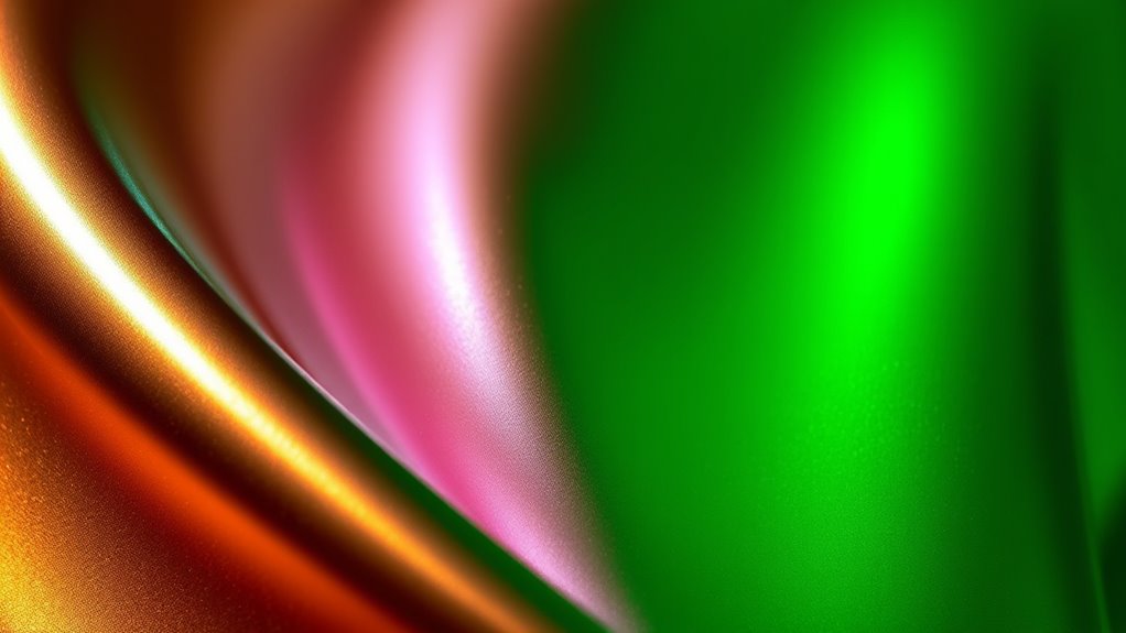
As designers seek to elevate their palettes in 2025, metallics and sheens are taking center stage, adding an eye-catching shine to the color spectrum. Metallic finishes create a sleek, futuristic vibe, reflecting light to enhance depth and dimension. You’ll notice iridescent effects making colors shift and shimmer, giving your designs a dynamic, multi-dimensional quality. These finishes work well across various materials, from fabrics to paints, and instantly elevate any project. Incorporating metallics and sheens allows you to play with texture and light, making your creations stand out. Whether you choose subtle gloss or bold, reflective surfaces, adding shine with metallic finishes and iridescent effects transforms ordinary palettes into mesmerizing, luminous statements.
Color Blocking and Contrasts: Making Bold Statements
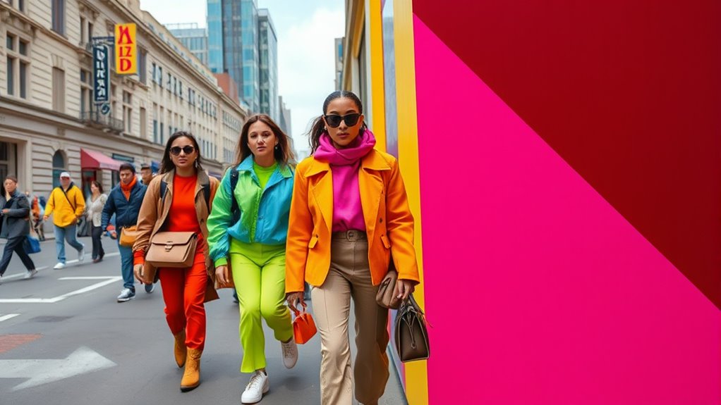
Color blocking and contrasts let you create bold, eye-catching looks that stand out. Pair vibrant hues or unexpected contrast combos to make a statement that captures attention instantly. These techniques turn simple outfits into powerful visual expressions. Incorporating contrasting colors can also boost your confidence by making your style unmistakably unique. Color theory principles help in selecting harmonious or striking combinations that resonate with your personal style, especially when considering visual organization for a cohesive look. Additionally, embracing a creative practice mindset allows you to experiment boldly with different color combinations, enhancing your overall style confidence.
Vibrant Color Pairings
Vibrant color pairings are transforming fashion with bold statements that catch the eye. When you combine striking hues, you leverage color psychology to evoke specific emotions—like confidence with fiery reds or calmness with cool blues. Cultural symbolism also influences your choices, as certain colors carry deep meanings across different societies, enhancing your message. To make a powerful impact, consider these pairing strategies:
- Pair complementary colors for maximum contrast
- Use analogous shades for harmony and depth
- Mix unexpected hues to challenge traditional norms
- Balance bright tones with neutral accents
Additionally, staying updated on color trends can help you incorporate the latest hues into your wardrobe for a fresh and modern look. Recognizing the importance of emotional responses to color combinations can further elevate your fashion statements, making your outfits not only visually striking but also emotionally resonant. Incorporating diverse crochet styles for locs can also add unique textures and accents to your overall look, blending fashion with creative expression.
Unexpected Contrast Combos
Unexpected contrast combos like color blocking and bold contrasts are revolutionizing how you make statements with your style. You’re no longer limited to subtle shades; instead, you embrace eye-catching pairings that command attention. Think monochrome minimalism with unexpected twists—pairing sharp black and white blocks or layering different textures within a single hue. Pastel reinterpretations add a softer touch, combining light pinks, lavenders, and mint greens in striking panels or accessories. These contrasts create visual drama, making even simple outfits stand out. The key is balancing the unexpected—juxtaposing vibrant colors with muted tones or mixing geometric shapes with subtle shades. With these combos, you turn everyday wear into bold, memorable statements that showcase your confidence and creativity.
Eye-Catching Visual Impact
When you want to make a bold statement, leveraging color blocking and high-contrast pairings instantly captures attention. These techniques create a striking visual impact by playing with color psychology and cultural symbolism. Bright, contrasting colors like neon green or fiery red evoke energy and confidence, while softer shades can convey harmony or sophistication. To maximize this effect:
- Use complementary colors for maximum contrast and vibrancy
- Incorporate cultural symbolism to add meaning and depth
- Balance bold blocks with neutral accents for clarity
- Experiment with unexpected color pairings to surprise and engage
Nature-Inspired Hues: Connecting With the Environment
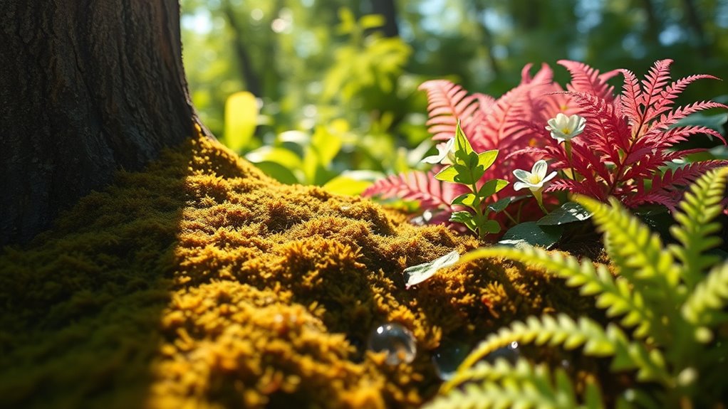
Have you noticed how nature-inspired hues are becoming more popular in design and fashion? These colors evoke a sense of calm and connection to the environment, making them perfect for those seeking authenticity. You’ll see plenty of flora motifs and botanical textures incorporated into clothing, home decor, and branding, emphasizing organic beauty. Think deep forest greens, earthy browns, and soft leaf tones that mirror the natural world. Using these hues, you can create spaces and styles that feel grounding and invigorating. The trend taps into a desire to reconnect with nature amid urban chaos, encouraging you to embrace colors that celebrate the environment’s diversity. By integrating these shades, you’re not only making a style statement but also showing your appreciation for the planet.
Minimalist Neutrals With a Twist
Minimalist neutrals continue to dominate design, but now they’re gaining a fresh twist that keeps things interesting. Instead of plain monochrome minimalism, designers are adding subtle variations within neutral palettes to create depth. You’ll see shades like warm taupe paired with cool greys or beige accents with soft browns. This approach adds visual interest without overwhelming simplicity. To achieve this, consider:
- Incorporating textured materials that highlight neutral tones
- Using layered neutrals for a nuanced, monochrome minimalism effect
- Playing with matte and gloss finishes for contrast
- Introducing unexpected neutral accents to break monotony
These subtle shifts make neutral palettes more dynamic and versatile, allowing you to craft spaces that feel both calm and mesmerizing. It’s a modern take that balances simplicity with a touch of sophistication.
The Influence of Digital and Tech on Color Choices
Digital and tech innovations are reshaping how you choose and experience colors, making them more dynamic and personalized. With digital branding tools, you can see how different colors influence perception and mood in real-time. Tech-driven palettes now allow designers and consumers to experiment with shades instantly, creating unique combinations tailored to individual preferences. Augmented reality apps let you visualize color schemes in your space before committing, while AI algorithms suggest trending hues based on your browsing habits. These advancements make color selection more interactive and data-driven, empowering you to craft visuals that resonate deeply. As a result, digital and tech influences are pushing color trends toward more vibrant, customized, and innovative expressions in 2025.
Practical Tips for Incorporating 2025’s Color Trends
To successfully incorporate 2025’s color trends, start by understanding the core palettes and their emotional impacts. Recognize how color psychology influences mood and perception, and choose shades that align with your message. Prioritize sustainability in color choices by selecting eco-friendly dyes and materials.
Here are some practical tips:
- Use bold colors as accent pieces to create visual interest without overwhelming.
- Mix trendy shades with timeless neutrals for balance and versatility.
- Opt for sustainable paints and dyes to support eco-conscious practices.
- Experiment with color blocking to showcase vibrant trends effortlessly.
Frequently Asked Questions
How Will Sustainable Materials Influence Color Trends in 2025?
You’ll see sustainable materials shaping color trends in 2025 by emphasizing eco-friendly pigments and recycled textiles. These materials inspire more earthy, muted tones and vibrant shades, reflecting environmental consciousness. As designers prioritize sustainability, expect to see colors that symbolize nature, renewal, and innovation. Your choices will be influenced by the growing demand for eco-conscious options, making sustainable materials central to future color trends, blending aesthetics with responsibility seamlessly.
Are There Specific Industries Leading the Color Trend Adoption?
You’ll notice that industries like corporate branding and fashion runway are leading the way in adopting new color trends. Companies use bold, fresh hues to stand out, while designers incorporate vibrant shades to captivate audiences. These sectors drive innovation, setting the tone for what’s popular. As a result, their influence shapes the broader color landscape, making sure the trend reaches consumers and permeates various markets.
How Do Cultural Differences Impact Global Color Preferences in 2025?
You’ll find that cultural symbolism and regional color meanings greatly influence global color preferences in 2025. Different cultures associate certain hues with specific emotions or traditions, shaping what’s popular in each area. As you explore these trends, remember that understanding local symbolism helps brands connect authentically. This diversity makes the color landscape rich and dynamic, ensuring that what’s trendy in one region might differ markedly elsewhere, driven by cultural nuances.
Will Traditional Color Palettes Remain Relevant Amidst Bold New Trends?
You might wonder if traditional color palettes will still matter amid bold new trends. The truth is, timeless elegance and classic contrast remain relevant because they provide balance and sophistication. While vibrant shades like neon green grab attention, incorporating classic hues ensures your designs are versatile and enduring. So, even with exciting innovations, traditional colors will continue to play a crucial role, blending old and new seamlessly in your creative work.
What Role Do Emerging Technologies Play in Creating New Color Shades?
Emerging technologies like AI-driven color prediction help you develop innovative shades by analyzing trends and consumer preferences quickly. Augmented reality color testing lets you visualize new colors in real-world settings before production, saving time and reducing waste. These tools empower you to experiment confidently, creating unique hues that stand out. By harnessing technology, you can stay ahead of trends and craft vibrant, appealing palettes that resonate with your audience.
Conclusion
As you embrace 2025’s vibrant palette, imagine transforming your space with earthy Mocha Mousse or energizing neon green. Think of a small cafe that used bold color blocking to attract customers—proof that these trends truly make a statement. Don’t be afraid to experiment and reflect your personality in your choices. This year’s colors are about connection, creativity, and making your environment uniquely yours. Plunge into and let your style shine brightly.